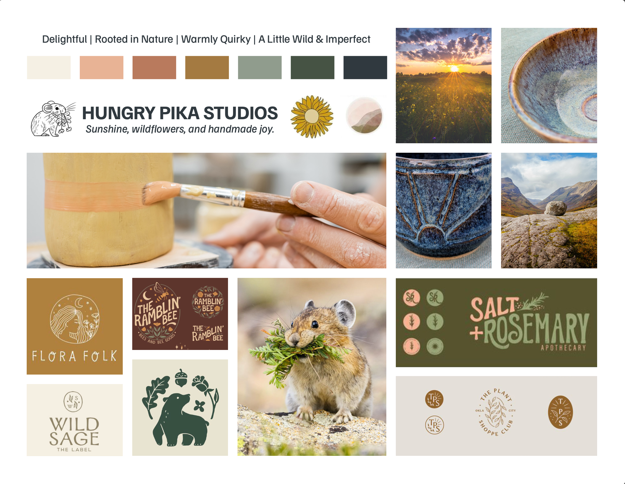
Branding for Artists: The Story Behind Hungry Pika Studios’ Playful New Logo
The Vibe + Vision
Client: Hungry Pika Studios
Industry: Handmade Goods + Creative Arts
Project Scope: Logo Design + Branding
Vibe Words: Joyful, Nature-Inspired, Playful, Grounded, Whimsical
Goal: Create a logo that reflects Leah’s love of nature, craft, and curiosity — a brand identity that feels as handmade and heartfelt as the art she creates.
A Glimpse Into the Brand
There’s a special kind of joy that comes from helping another artist bring their creative identity to life.
Hungry Pika Studios is the creative home of artist Leah, whose handmade pieces are infused with wonder, color, and the natural world. From quilting and painting to pottery and beading, her work celebrates beauty in everyday materials. Each piece is a small reminder of what it means to live with creativity and care.
When Leah reached out, she wanted a logo that could hold all that energy — something playful yet refined, grounded yet full of life. It was also her first time having a logo created, a meaningful milestone as she stepped fully into her artist identity and began sharing her work more publicly. The design process became part of that transformation — helping her see her creative practice as a cohesive, intentional brand.
Before diving into visuals, we began with The Brand Clarity Key — the first step in my Aligned Branding Journey and the foundation for every design decision that follows. This collaborative deep dive uncovers the heart of a brand — its story, values, audience, and emotional tone — and translates those insights into clear creative direction.
For Hungry Pika Studios, The Brand Clarity Key revealed a brand rooted in curiosity, connection, and joy — a reflection of Leah’s love for nature and her desire to bring warmth and wonder into everyday life.
Meet the Pika, the Brand Inspiration
If you’ve never heard of a pika, imagine a small, mountain-dwelling creature that spends its days collecting bits of grass and flowers to prepare for winter. They’re industrious, adorable, and a little unexpected — just like Leah’s approach to creativity.
That spirit became the heart of her brand: collecting, crafting, and connecting through handmade art that brings joy to others.
The Creative Direction
Before we touched color or composition, we talked about feeling — how Leah wanted her brand to feel when people encountered it. Words like joyful, curious, and connected to nature kept coming up.
We wanted the logo to feel approachable and organic — not overly polished, but still intentional. The design needed to mirror Leah’s creative process: one part intuitive play, one part thoughtful craft.
Next, Leah gathered inspiration on Pinterest — hand-drawn florals, folk-art motifs, and soft earthy palettes that reflected her love of nature and the handmade.

Using Leah’s inspiration, I created a mood board featuring hand-drawn florals, folk-art motifs, and soft earthy tones — all reflecting her love of nature and the handmade.
The Logo Design Process
This project was a true collaboration.
To start, I asked Leah to draw several pikas in her own hand, encouraging her to explore the personality of the creature behind her brand. Her drawings had so much charm that I wanted to preserve their spirit while refining them into a clean, professional mark.
From there, I refined her drawings digitally, simplifying shapes, balancing proportions, and creating a mark that still felt personal and handmade. The result was a logo with her creative fingerprint woven right into it — a symbol that couldn’t have come from anyone else.

Exploring Variations: Building a Logo Family
From the beginning, Leah knew she wanted a custom ceramic stamp — a mark she could press into her pottery to sign each piece by hand. That practical need became the inspiration for a flexible logo system that could live beautifully both on screen and in clay.
As the design evolved, Leah found herself drawn to several initial concepts — each highlighting a different side of Hungry Pika Studios: the playful spirit of the pika, the warmth of handmade craft, and the grounding connection to nature.
Rather than forcing a single choice, we built a logo family that honored them all: the full logo with tagline, circular and arched alternates, and a simplified stamp mark.
Together, they give Leah the freedom to adapt her visuals across every touchpoint — from packaging and business cards to digital graphics and pottery impressions — while keeping a unified, handmade feel throughout.

“I LOVE my new logos! I’m so excited to start using them!”
The Final Design: A Playful Expression of Artistry
From this collection of marks emerged a visual rhythm that feels dynamic, joyful, and true to Leah’s creativity. Each variation works in harmony, creating a cohesive identity that moves easily from print to digital, from art tags to pottery stamps.
The primary logo blends organic lettering with the hand-drawn pika, grounding the brand in both professionalism and play. The alternate marks provide versatility — perfect for small-scale uses or moments that call for a touch of warmth and texture.
After finalizing the logo family, I created a concise Brand Standards Guide to ensure Leah could carry her new identity consistently across all her creative touchpoints.
“This whole process helped bring my ideas into focus and gave me a clear jumping-off point for what I want to do with Hungry Pika,” Leah shared.
Most importantly, every piece of the system feels like Leah — handmade, heartfelt, and full of joy.
“I’m so pleased with this whole process — it totally exceeded my expectations!”
A Creative Conversation
Designing for artists always feels like a special exchange — a creative conversation between two makers.
For Leah, this logo wasn’t just about a new visual identity; it became a symbol that celebrates the joy of making and the beauty of her process.
“I LOVE my new logos! I’m so excited to start using the logos!” — Leah, Hungry Pika Studios
If you’re an artist or maker ready for a brand that truly feels like you, I’d love to help bring your creative vision to life.

Hiya! I’m Lexis, the author of this blog.
If you’re here to build a brand that feels beautiful, meaningful, and true to you, I’m so glad you found your way.
At Most Beautiful Design, I blend intuition, creativity + strategy to help purpose-driven entrepreneurs craft brands that truly reflect who they are.
When I’m not designing, you’ll find me watercoloring alongside my kids, wandering outside, or cozied up with a good book (creativity, business, or personal growth are always at the top of my list). And yes—color makes me ridiculously happy!
Curious about what lights me up and how I work?
Start here to get a feel for my vibe, or peek at my services if you're dreaming up a brand or website that finally feels like you.