From Solo Practice to Collaborative Care: The Story Behind Ginkgo Way’s Brand
The Vibe + Vision
Client: Ginkgo Way
Industry: Trauma-informed therapy + coaching
Project Scope: Brand strategy (Brand Clarity Key), logo design, website design (Squarespace), and full website copywriting
Vibe Words: grounded, warm, relational, collaborative, honest, transformative
Goal: Evolve from a solo practice into a brand that reflects a collaborative, family-led model of care
Meet Jill + The Shift She Was Stepping Into
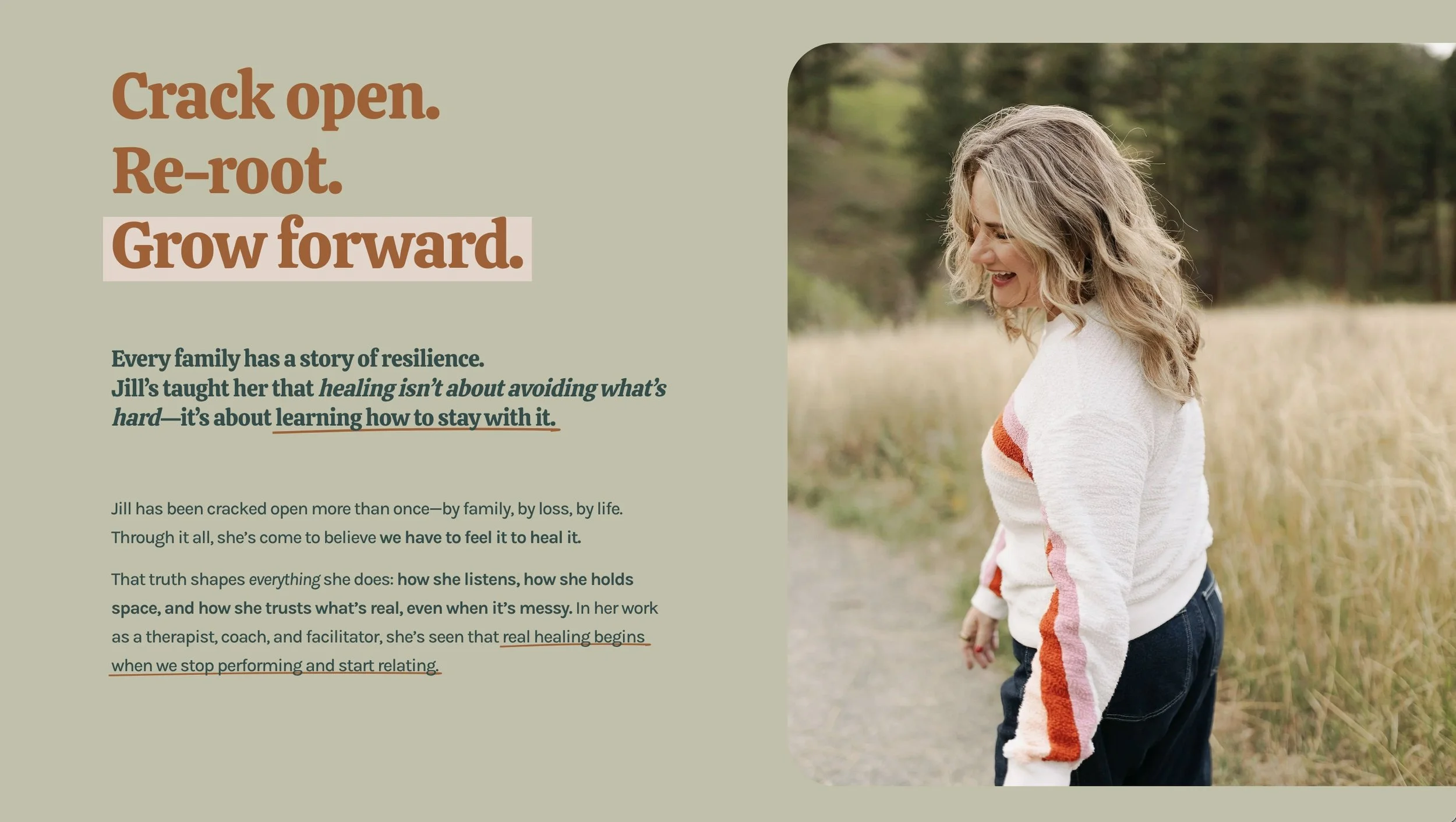
Jill, founder of Ginkgo Way, came to me at a turning point.
Her previous business, Krush Counseling, had been built around her individual practice—but the work had outgrown that structure.
She wasn’t just offering therapy anymore.
She was building something more expansive—a collaborative, trauma-informed space where therapy and coaching come together. A practice that includes 1:1 work, group intensives, retreats, workshops, and a growing network of trusted practitioners (including her family).
Less clinical. More human.
More relational. More alive.
She needed a brand that could hold all of that.
Before There Was a Name
Jill didn’t come to me with a fully formed brand. She didn’t even have a name yet.
What she had was a body of work that had been building for years—a deep commitment to healing, both in her own life and in how she supports others.
She knew she was creating something new—bringing together her family, her experience, and the many ways she works: therapy, coaching, group work, retreats, and experiential practices.
But the pieces weren’t fully connected yet.
That’s often how this work begins.
Not with a clear structure—but with a sense that something bigger is ready to take shape.
When Your Therapy Brand No Longer Fits
It was clear her existing brand felt too small for where she was going.
It didn’t reflect:
the collaborative nature of the new practice
the depth + range of her work
the shift from “just Jill” → a shared, relational space
She wasn’t just refining a brand—she was redefining the container her work would live inside.
A container for people navigating transitions, unraveling old patterns, and reconnecting with themselves in a more embodied way.
Branding for Therapists Starts with Clarity
This is where the work begins.
Not with a logo—but with clarity.
That’s why every project I take on starts with the Brand Clarity Key—a process designed to uncover the truth of your brand before we design anything.
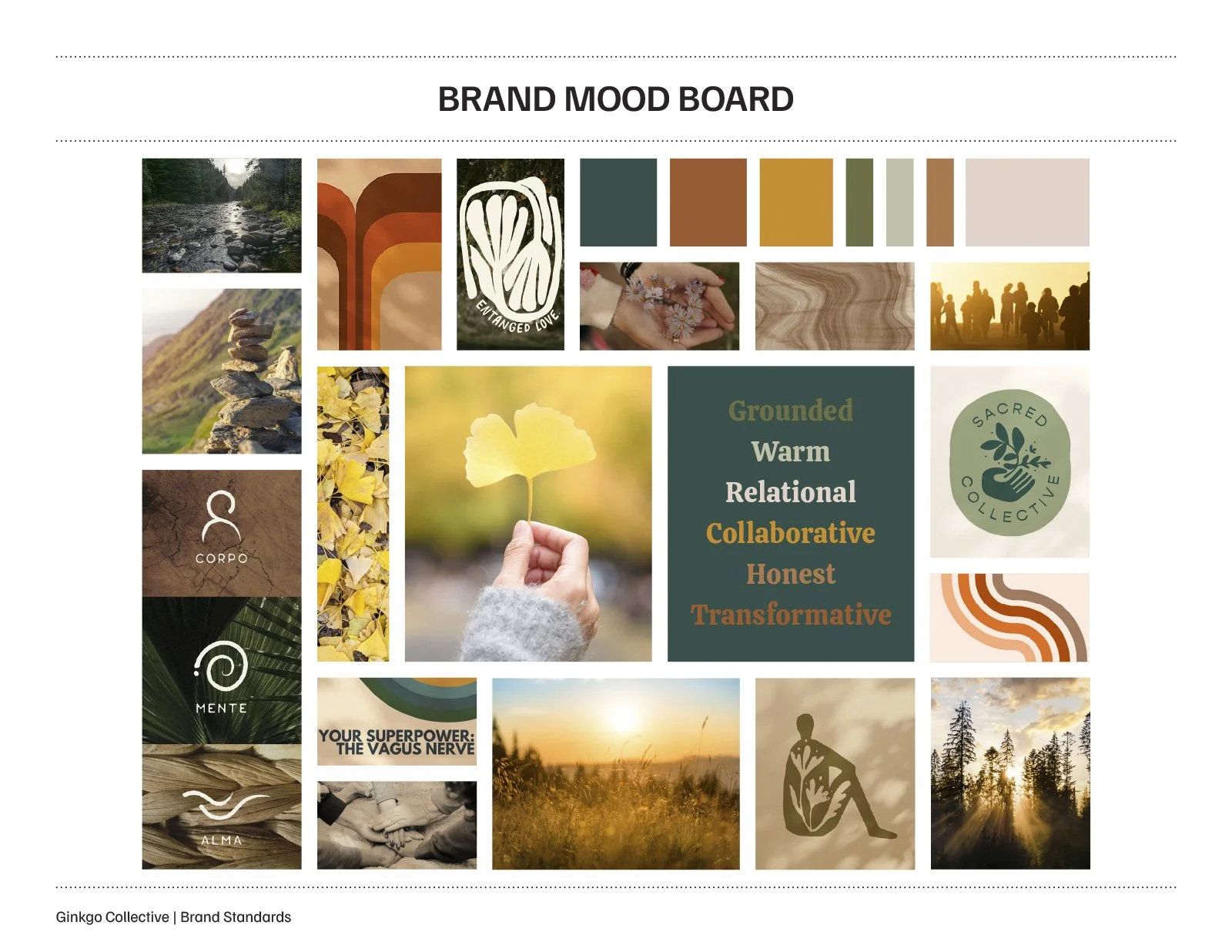
What stood out immediately was her way of working—grounded, relational, and deeply human. A blend of professional training and lived experience, held with warmth and playfulness.
We clarified:
the full scope of her work
how each offering fits together
the feeling her brand needed to hold
the deeper message underneath it all
This isn’t about brainstorming ideas—it’s about uncovering what’s already there and giving it language.
What emerged was simple, but powerful:
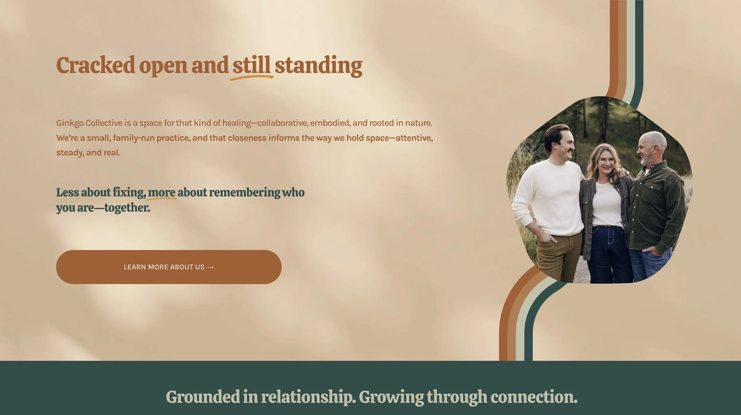
Reconnection. Regulation. Remembering who you are.
Not just a tagline—a reflection of how her work actually feels.
Translating Feeling Into Form
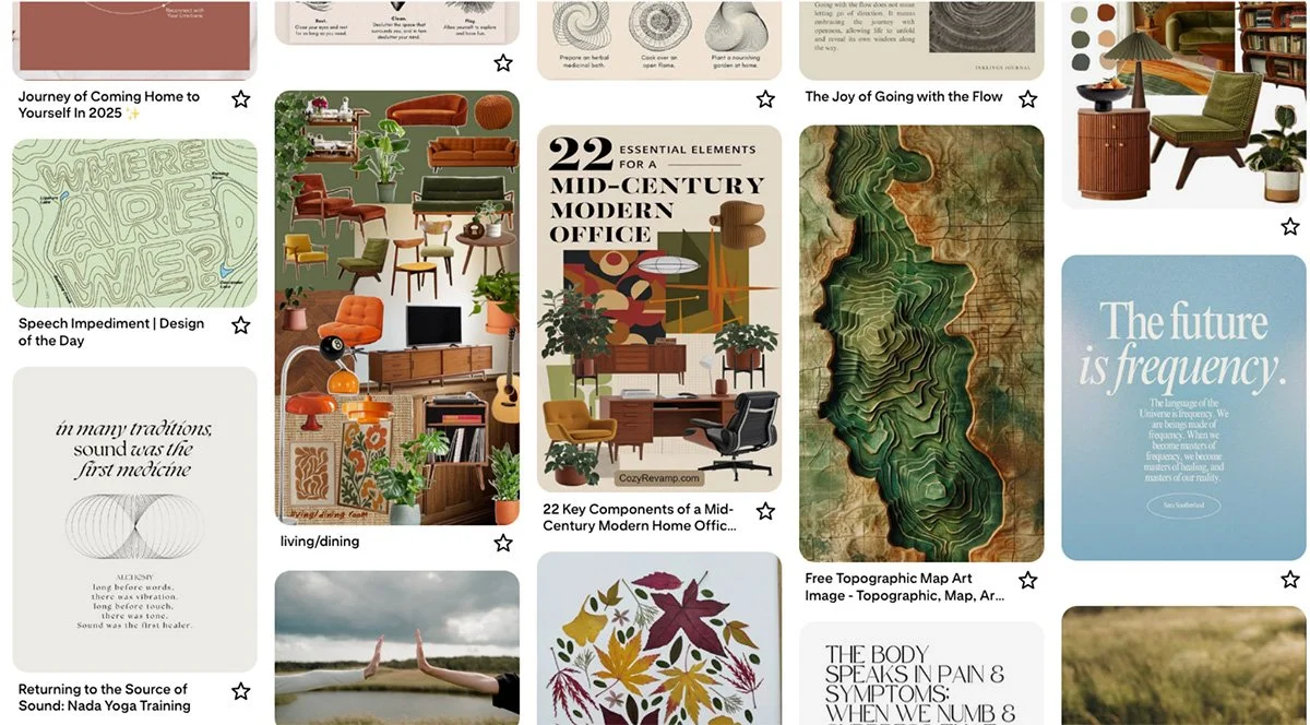
Jill had pinned a collection of mid-century modern spaces—warm woods, curved lines, organic shapes, a vintage palette.
Not “branding,” technically—but full of feeling.
That’s where the direction clicked.
Here’s a glimpse of the Pinterest board she shared—mid-century interiors, natural textures, and warm, grounded tones.
The truth is often here—not in logo references, but in what someone is naturally drawn to.
From there, I translated those patterns into a focused visual direction that felt:
grounded + natural
structured, but not rigid
warm, but not overly soft
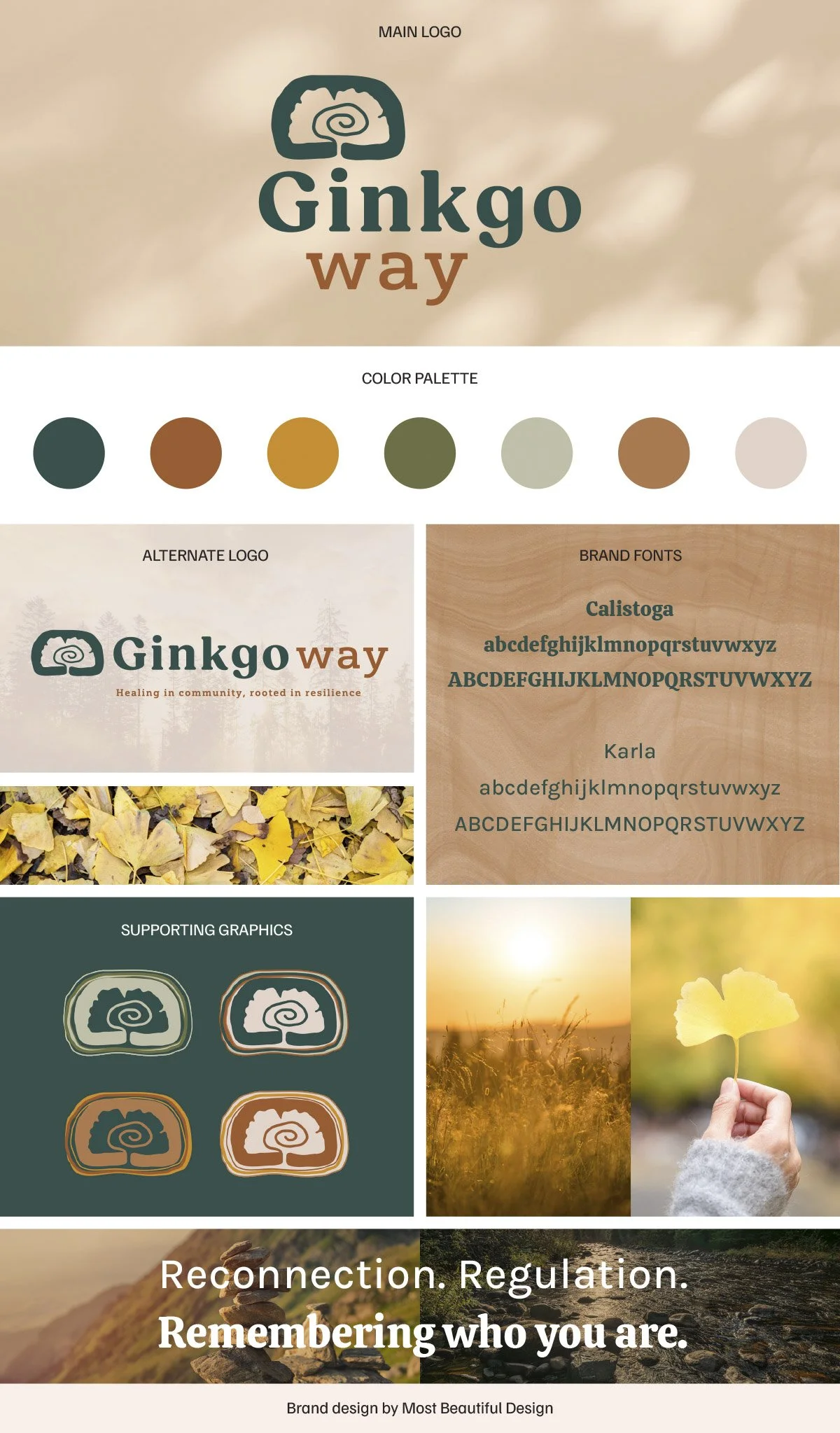
The ginkgo leaf became the central symbol—but not by accident.
In the Brand Clarity Key, Jill named the ginkgo tree as a core influence—drawn to its resilience, longevity, and ability to endure through extreme conditions. Often called a “living fossil,” it has survived for millions of years, even in environments where little else could.
That meaning aligned directly with her work.
Supporting people through rupture, transition, and healing—helping them reconnect, regulate, and rebuild.
The logo became a visual expression of that: quiet strength, grounded growth, resilience over time.
Everything else followed:
earthy, sun-warmed tones
typography that feels steady and human
organic forms that echo continuity and connection
You can see this balance reflected in the final identity.
The Moment It Landed
After the second round of logo refinements, Jill said:
“Very aligned with all of it and I absolutely love the one with the tree rings… It’s brilliant.”
That’s the moment I’m always listening for.
Not just “this looks good”— but this feels like me.
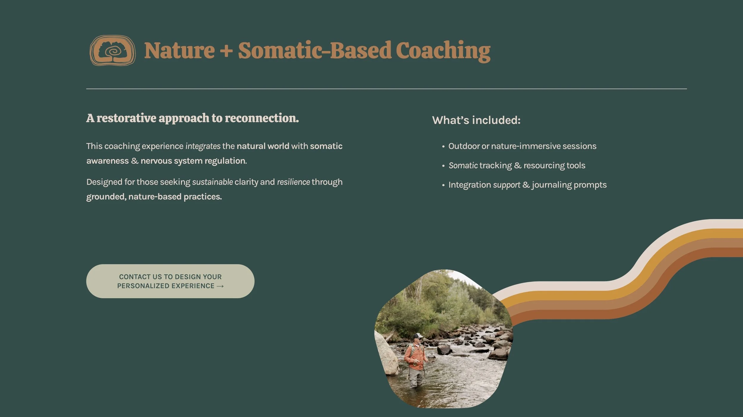
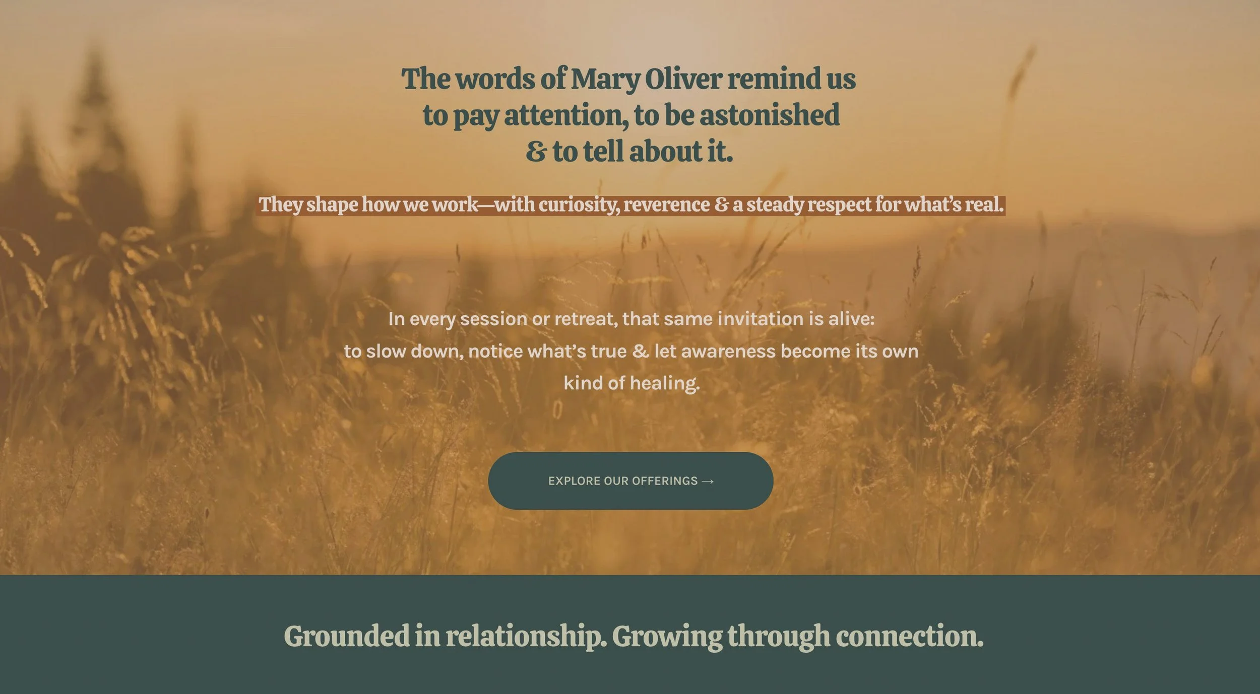
Therapist Branding + Website Design, Brought Together
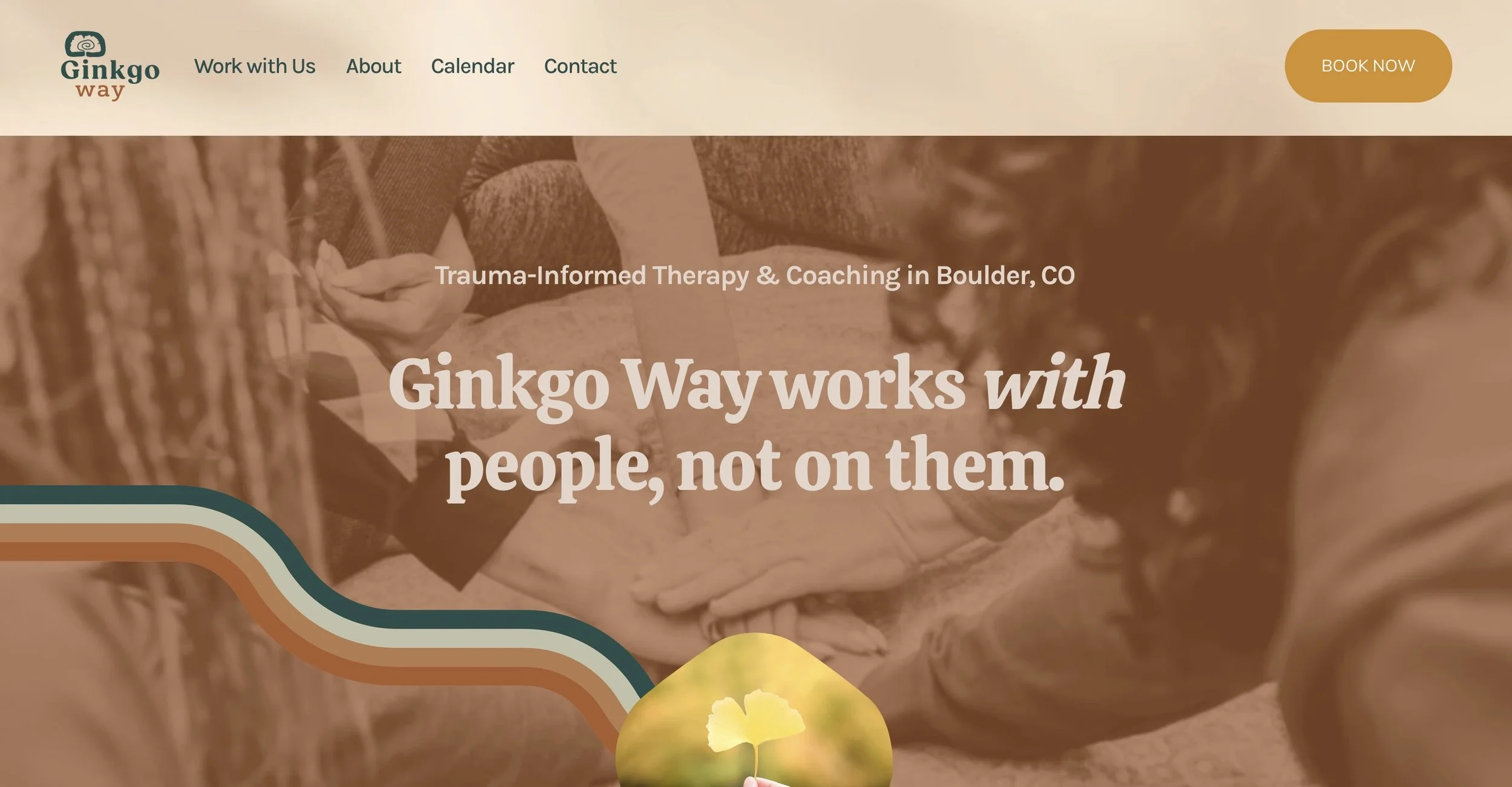
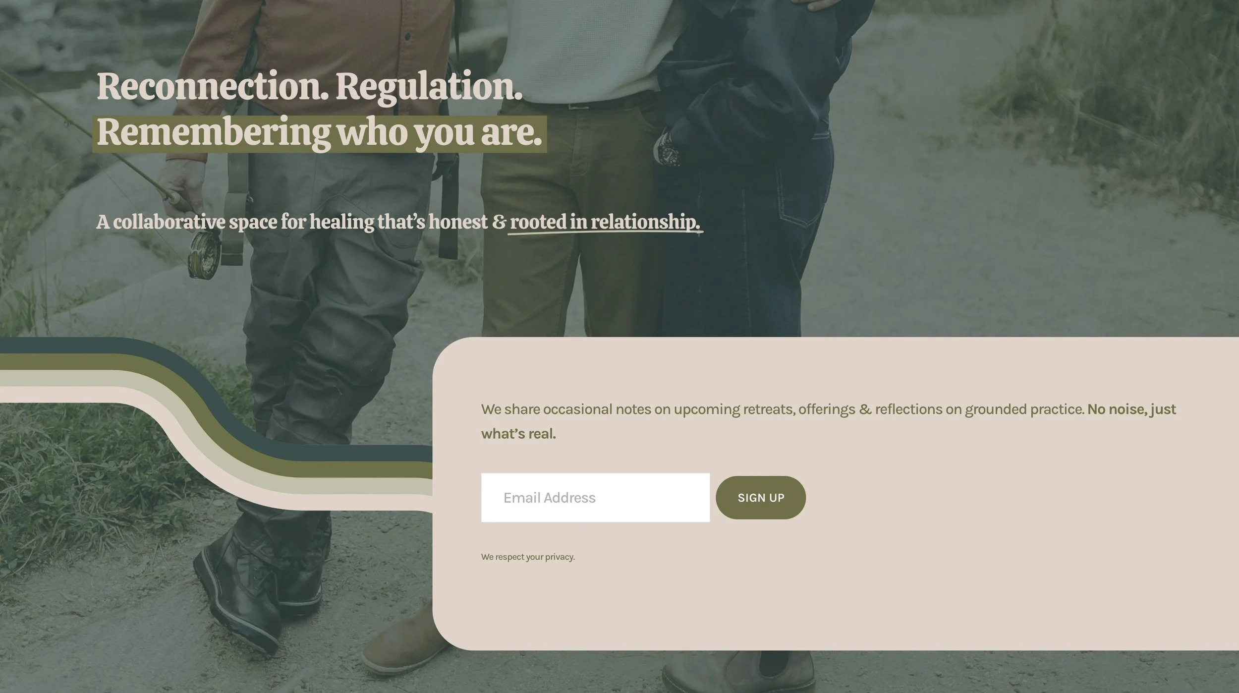
With the brand direction clear, we built a full Squarespace website to match.
This is where strategy, design, and copy come together into one cohesive experience.
The goal was to create a space that reflects how Ginkgo Way actually works:
holding both therapy and coaching without forcing them into boxes
supporting multiple practitioners and collaborative offerings
feeling grounded, relational, and easy to navigate
I wrote the full website copy alongside the design—so messaging and visuals could develop together.
We shaped language that makes it clear:
this isn’t a traditional therapy model—
it’s a more flexible, human approach to care.


A Therapy Practice Rebrand That Feels Aligned
Ginkgo Way now has a brand and website that feel like an extension of the work itself.
Grounded. Relational. Expansive.
A space that:
reflects the shift from solo practice → collaborative model
communicates a layered, evolving body of work with clarity
invites people into a deeper, more human kind of support
✨ See the full website here
This site launched in early 2026.
Thinking About Your Own Brand?
If your business has evolved—but your brand hasn’t caught up—I’d love to help.
That gap between where you are and how you’re showing up?
That’s where this work begins.
Start with clarity.
That’s what the Brand Clarity Key is designed for.

Hiya! I’m Lexis, the author of this blog.
If you’re here to build a brand that feels beautiful, meaningful, and true to you, I’m so glad you found your way.
At Most Beautiful Design, I blend intuition, creativity + strategy to help purpose-driven entrepreneurs craft brands that truly reflect who they are.
When I’m not designing, you’ll find me watercoloring alongside my kids, wandering outside, or cozied up with a good book. And yes—color makes me ridiculously happy!
Curious about what lights me up and how I work?
Start here to get a feel for my vibe, or peek at my portfolio if you're dreaming up a brand or website that finally feels like you.