Rooted in Energy + Intuition: The Story Behind The Violet Space's Reiki Branding
The Vibe + Vision
Client: The Violet Space
Industry: Reiki + Energy Healing
Project Scope: Logo Design, Branding, Squarespace Website
Vibe Words: Grounded | Warm & Wise | Softly Magical | Inspired by the Natural World
Goal: Create a visual identity + website that supported Tanya’s Reiki practice as its own offering—separate from her salon—and gave her a place to grow
Where we started
When Tanya came to Most Beautiful Design, she was ready to step into something new—a Reiki brand identity that felt like a true reflection of who she is becoming.
As a salon + spa owner and Reiki practitioner in Denver, Tanya was carving out space for her energy work to stand on its own.
She envisioned something grounded and wise, softly magical, and inspired by the natural world.
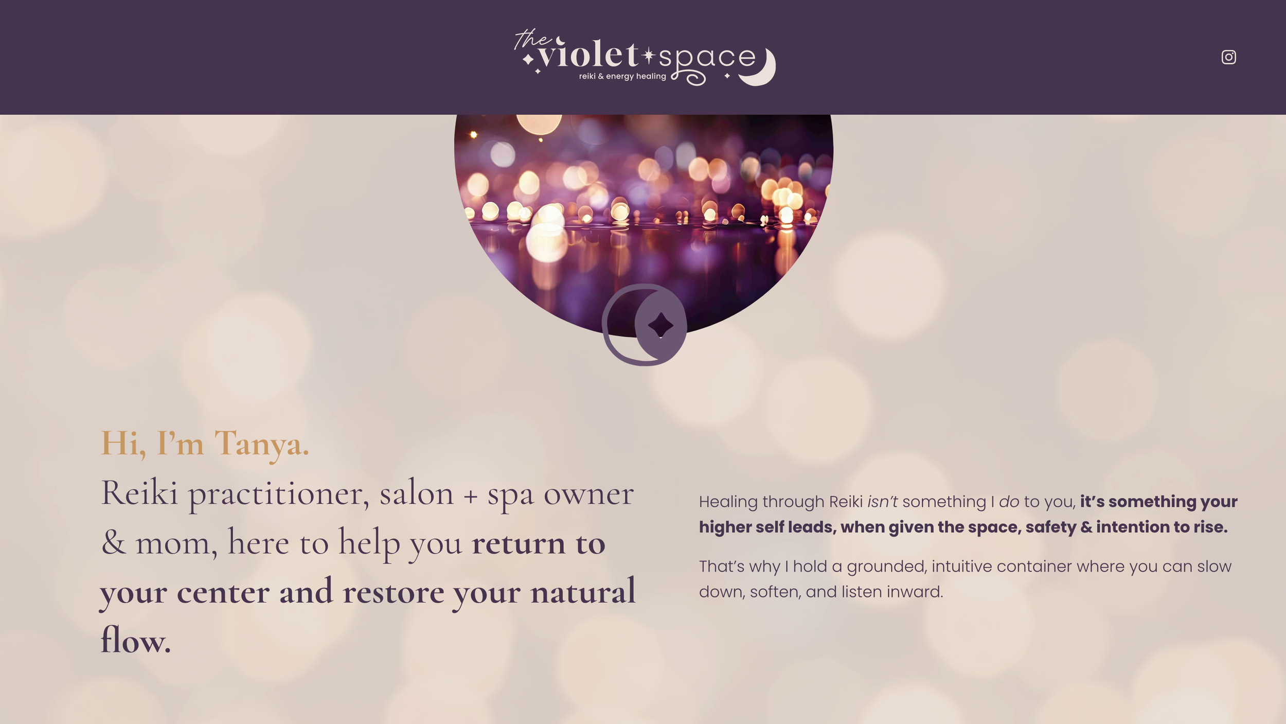
Meet Tanya
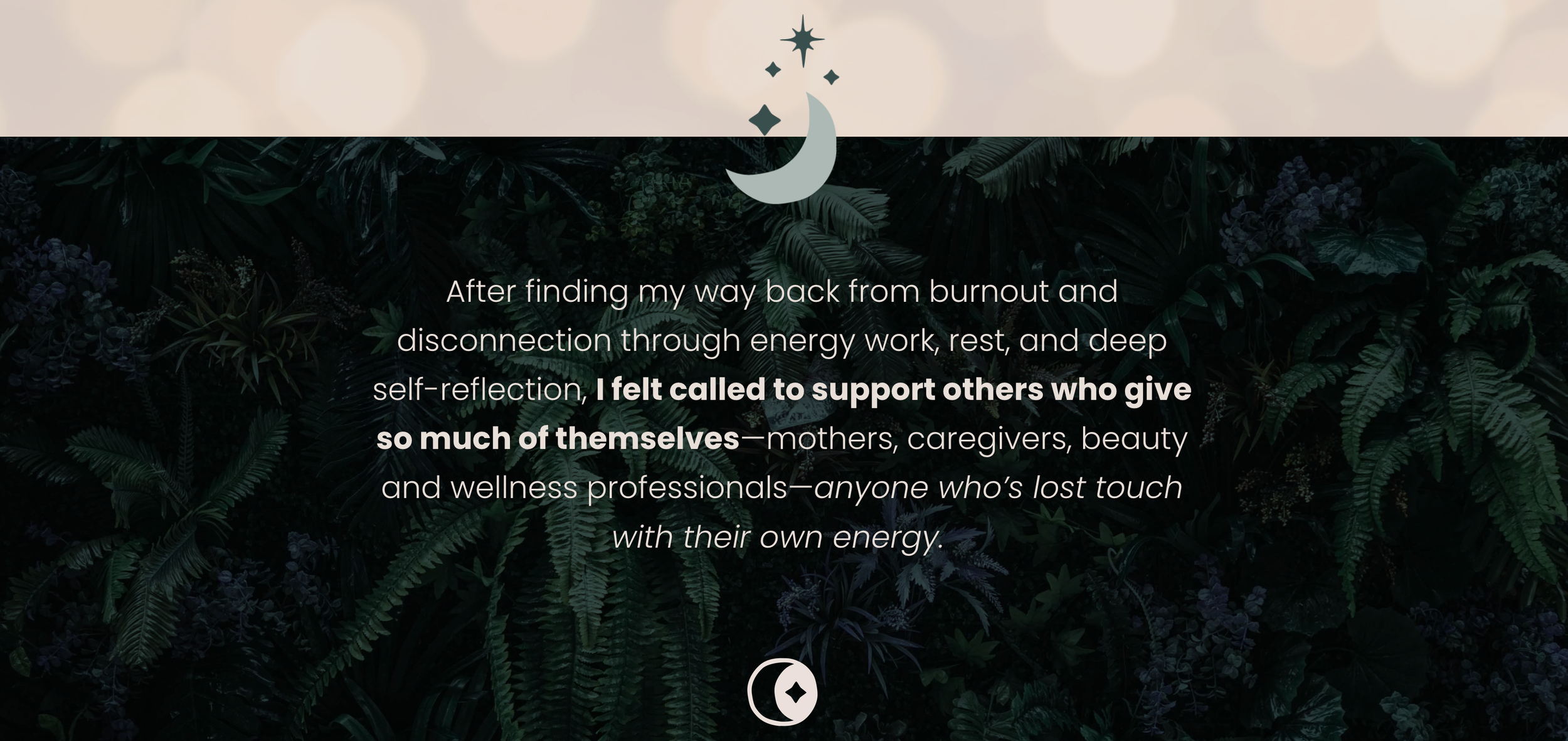
Tanya is a Reiki practitioner, salon owner, and mom whose intuitive presence brings a sense of calm to everyone she works with. Her own healing journey back from burnout inspired her to support others—especially caregivers, mothers, and wellness professionals—who feel like they’ve lost touch with their own energy.
She wanted a brand identity and website that felt like her: grounded, intuitive, and warm. Something that could grow with her as her Reiki practice evolved—and that reflected the softness, safety, and subtlety of her healing work.
The Logo + Brand Design Process
From the very beginning, I could feel the steady, powerful undercurrent of Tanya’s work. She leads with grounded care—not performance—and her presence creates a space for people to slow down, soften, and reconnect with their center.
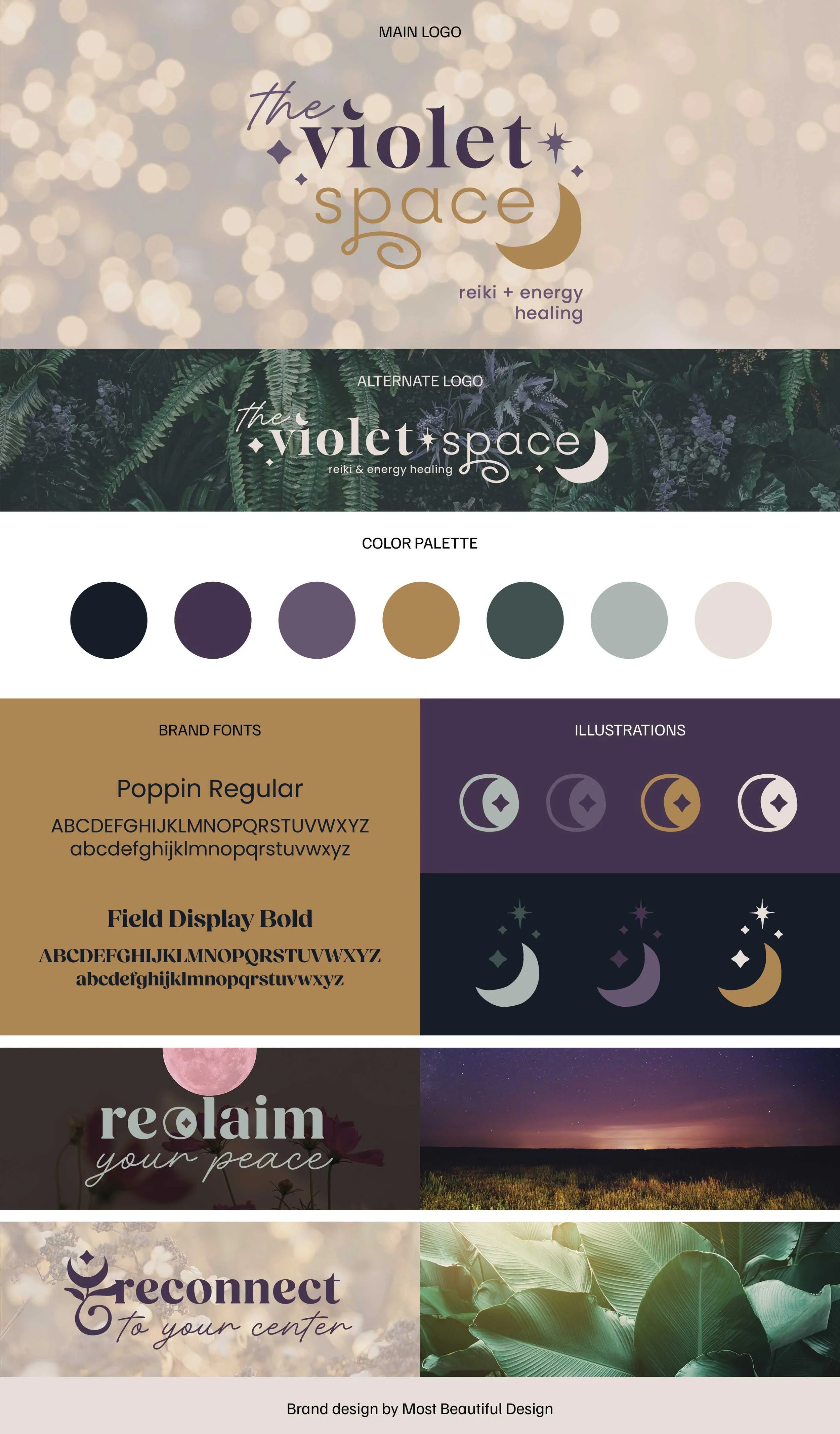
The moodboard was our compass: lush, shadowy greens, vibrant violets, gentle sparkles of light, and symbols rooted in earth and energy.
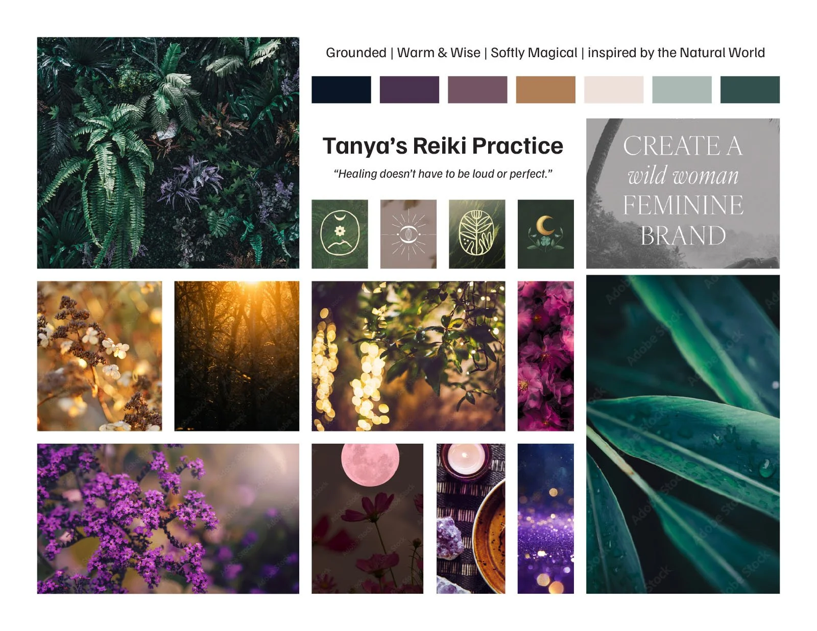
Tanya had a deep love for New Orleans magic and mysticism, and we leaned into that feeling with her custom brand icon—a crescent moon and guiding spark—paired with deep jewel tones and warm neutrals.
The result? A visual identity that honors the quiet power of her work. Nothing loud. Nothing overly designed. Just an intuitive brand presence that invites clients inward.
We captured this all through the Brand Clarity Key, which uncovered the story, language, and energy at the heart of her work. From there, the refined Brand Summary and Brand Mood Board became the foundation for everything that followed.
A Website That Holds Space
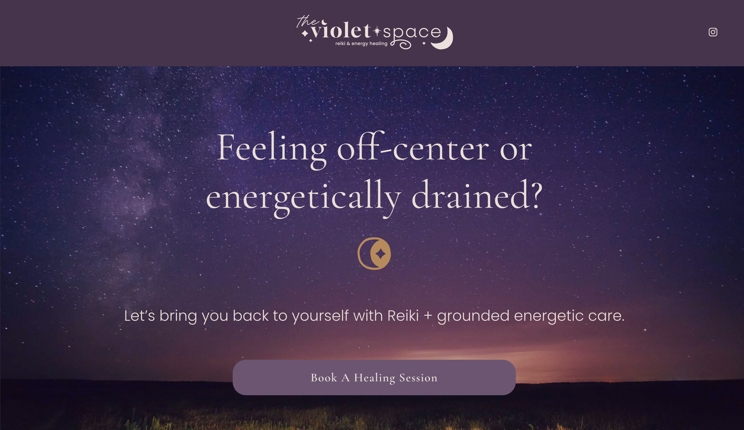
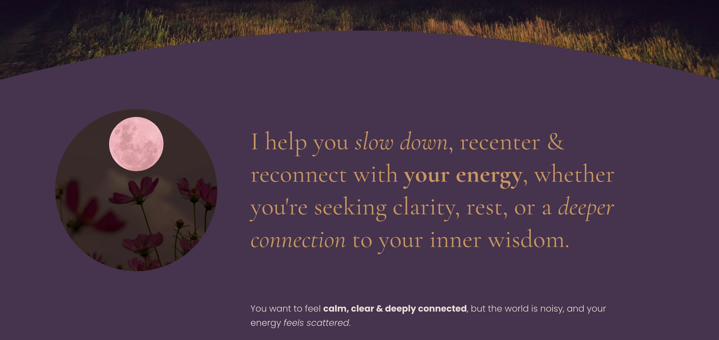
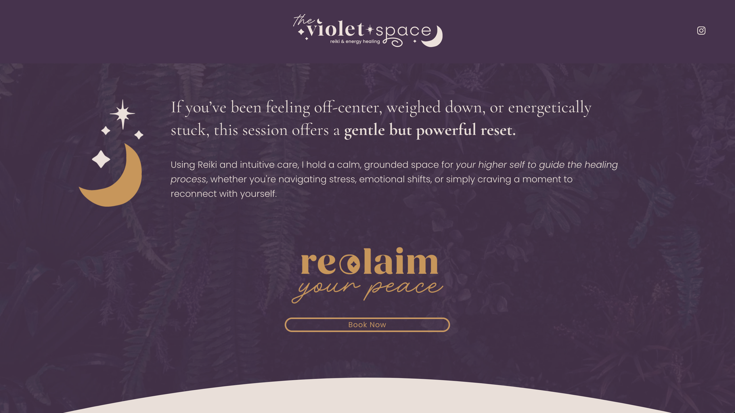
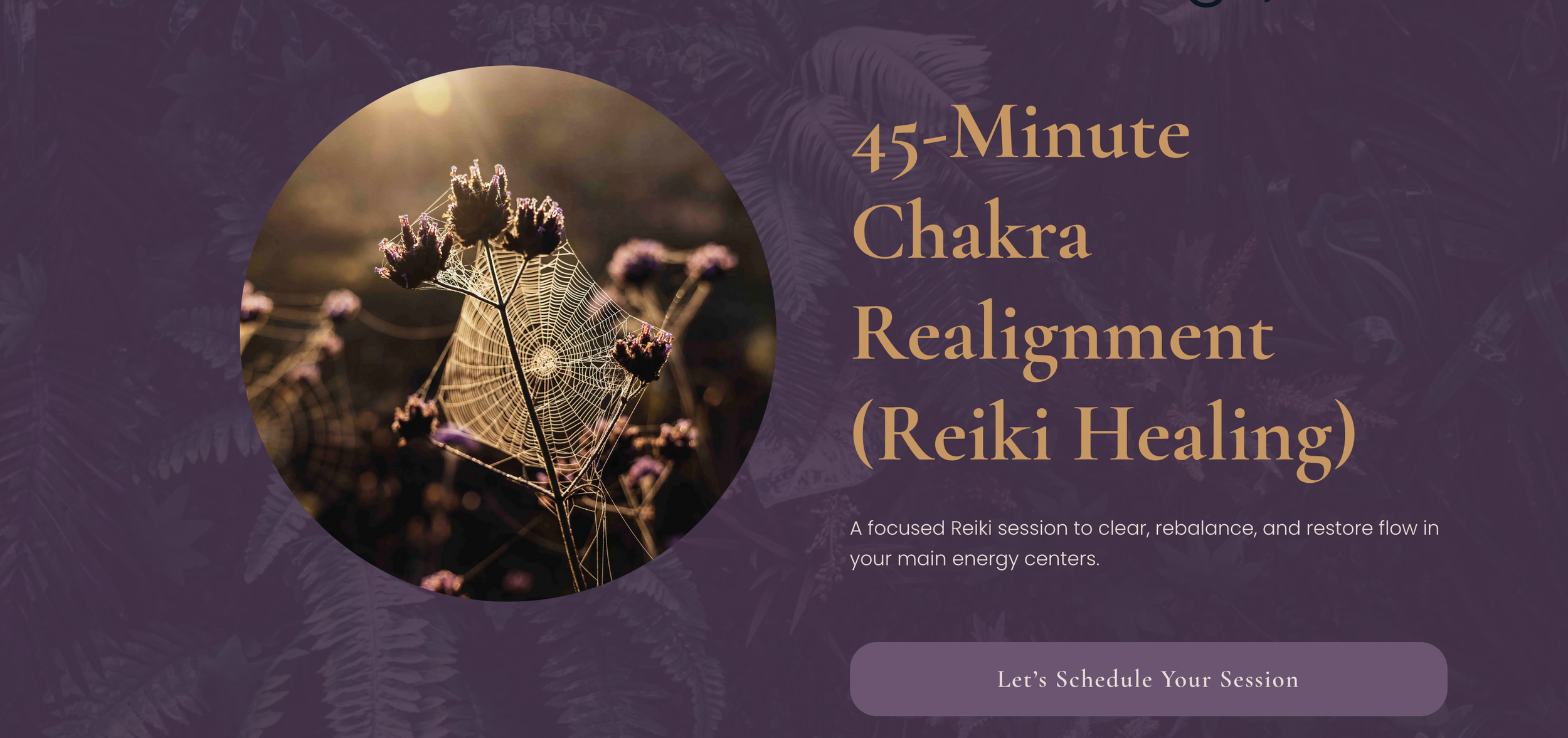
Tanya’s Squarespace website is a reflection of her energy: welcoming, intuitive, and easy to navigate. It invites the visitor in with gentle language—"Feeling off-center or energetically drained?"—and offers clear, simple pathways to connect, book a healing session, or learn more.
We kept things minimal to reflect her grounded approach. Strategic use of color, light, and space creates a sense of calm, while every word on the page is purposeful and rooted in Tanya’s voice.
Tanya used my Website Copy Template and the Brand Summary we developed to draft her copy — pulling forward the tone, clarity, and confidence that had emerged during the branding process.
From there, I stepped in as copy editor, fine-tuning her words so everything felt approachable, clear, and aligned with her brand.
✨ Bonus: the site is designed to evolve with her. As new photos, offerings, or inspiration arrive, she has a beautiful foundation to build on.
👉 Visit the live site
The Final Feeling
Tanya’s reiki brand identity is a beautiful example of what happens when you blend intuitive clarity with intentional design.
Together, we created something that’s:
- Deeply aligned with her energy + values
- Grounded in visual storytelling
- Designed to grow with her practice
And most importantly—it feels like her.
Want a Reiki brand identity or wellness website that feels like you?
Let’s make something beautiful together.

Hiya! I’m Lexis, the author of this blog.
If you’re here to build a brand that feels beautiful, meaningful, and true to you, I’m so glad you found your way.
At Most Beautiful Design, I blend intuition, creativity + strategy to help purpose-driven entrepreneurs craft brands that truly reflect who they are.
When I’m not designing, you’ll find me watercoloring alongside my kids, wandering outside, or cozied up with a good book (creativity, business, or personal growth are always at the top of my list). And yes—color makes me ridiculously happy!
Curious about what lights me up and how I work?
Start here to get a feel for my vibe, or peek at my portfolio if you're dreaming up a brand or website that finally feels like you.