Behind the Scenes of StretchWorks: A Brand Rooted in Calm Strength + Vibrant Confidence
The Vibe + Vision
Client: StetchWorks
Industry: Fitness
Project Scope: Logo Design + Branding + Website
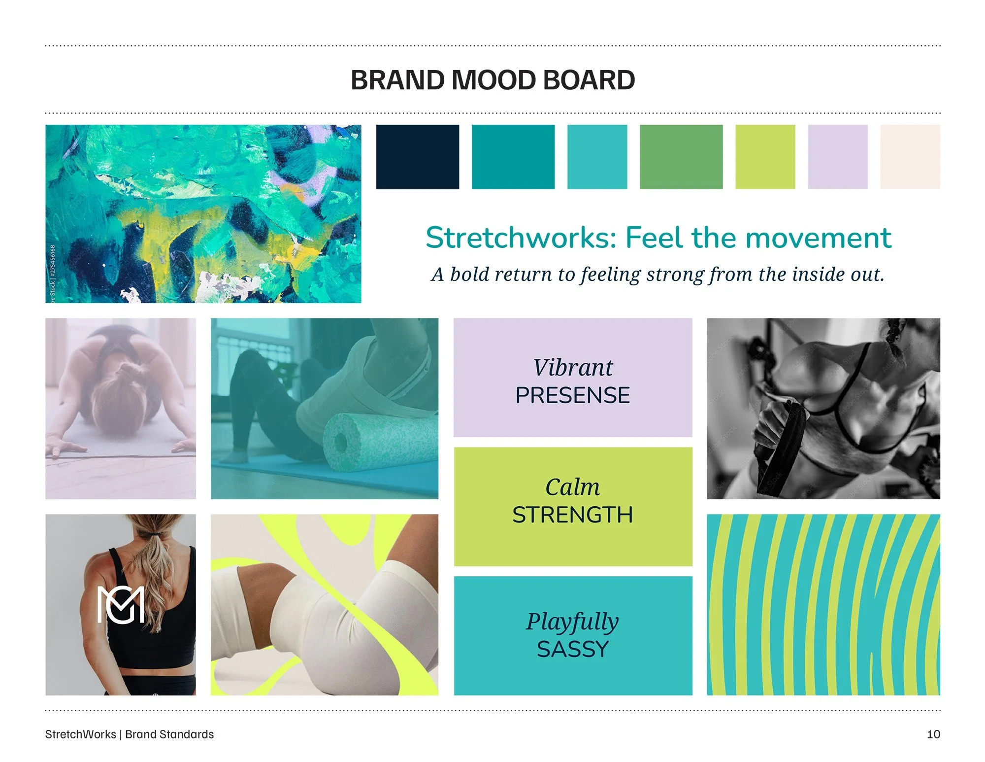
Vibe Words: Vibrant | Calm Strength | Honest + Real | Playfully Sassy
Goal: Create a logo and website that reflects Lexy’s calm, functional approach to strength training—a brand identity that feels as real and empowering as her coaching style.
Where we started
Lexy came to me at a turning point. She was ready to up level her business, StretchWorks, refine her focus, and step fully into her passion for helping women 40+ move well, feel strong, and reconnect with their bodies in a way that feels honest and sustainable.
What she didn’t want was another fitness brand full of intensity, pressure, or “go harder” energy.
What she did want was a brand that reflected the kind of strength she teaches: steady, functional, deeply embodied strength — with a playful edge.
A brand that sounded like her.
A brand that felt like her.
A brand that her clients would recognize immediately as “oh yes… that’s Lexy.”
What We Discovered Together
After Lexy completed my Your Brand, Your Story questionnaire, a few key themes rose to the surface:
Women 40+ don’t need another generic training program — they need support that honors the reality of midlife bodies
Strength doesn’t have to be loud
Mobility is freedom
Playfulness keeps people coming back
And confidence grows from calm, consistent work, not chaos
Lexy wanted a brand that carried all of that.
Not flashy. Not intimidating.
Just real, grounded, vibrant strength — the kind you can feel in your bones.
We captured this all through the Brand Clarity Key, which uncovered the story, language, and energy at the heart of her work. From there, the refined Brand Summary and Brand Mood Board became the foundation for everything that followed.
Creating the Logo
With Lexy’s brand story clear, the design process felt incredibly intuitive.
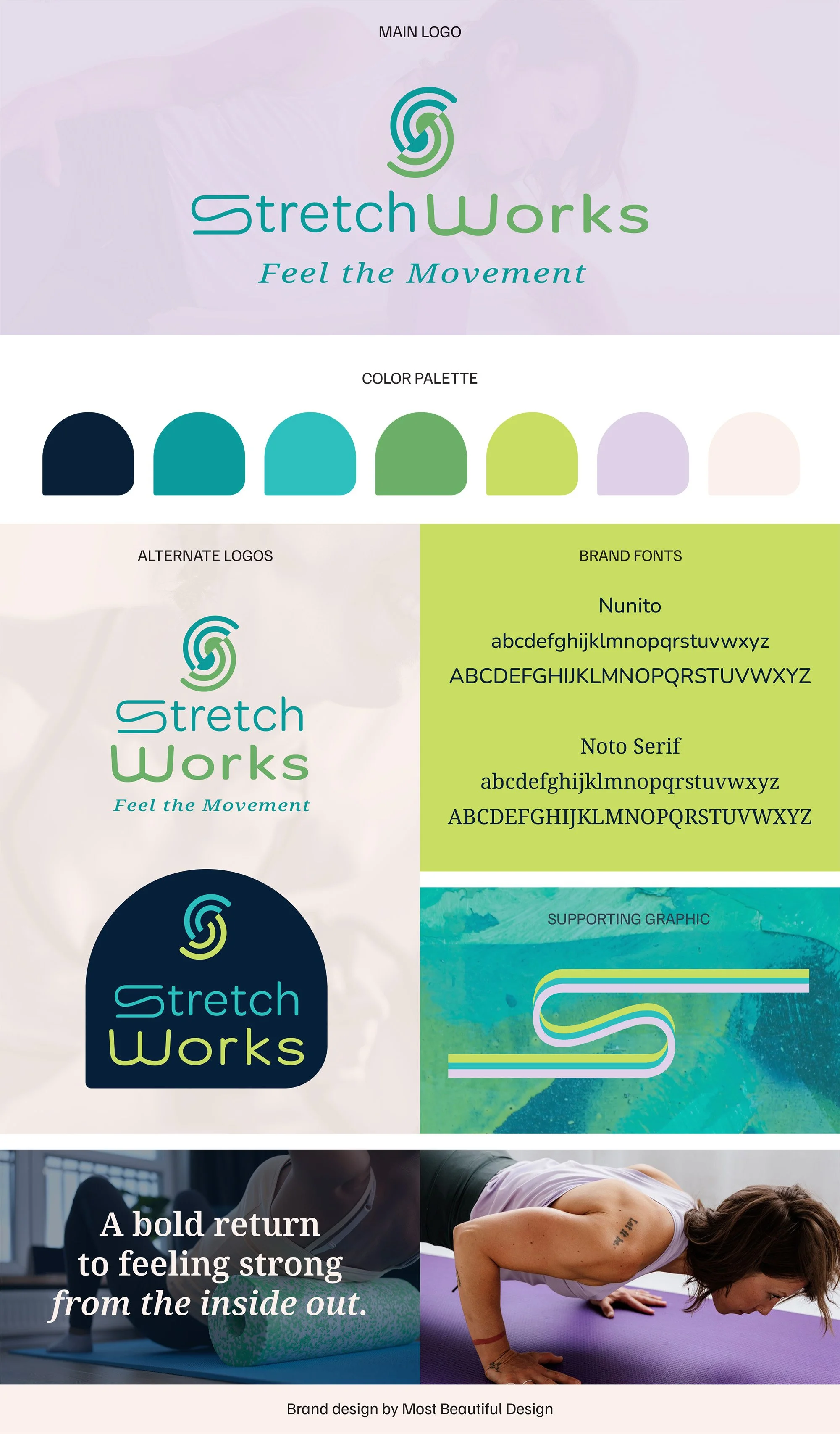
Her logo needed to hold movement without feeling frantic. Strength without becoming rigid. And femininity without slipping into anything overly soft or watered down.
The result was a symbol shaped intentionally into an “S” — a subtle nod to StretchWorks — but also a visual that flows.
It bends, curves, stretches… just like the women she trains.
It’s calm. It’s strong.
It’s undeniably Lexy.
Her color palette followed the same energy:
Vibrant tones to represent mobility and motivation, grounded with richer hues that communicate steadiness and trust.
Nothing trendy. Nothing performative.
Just a brand that knows who it is.
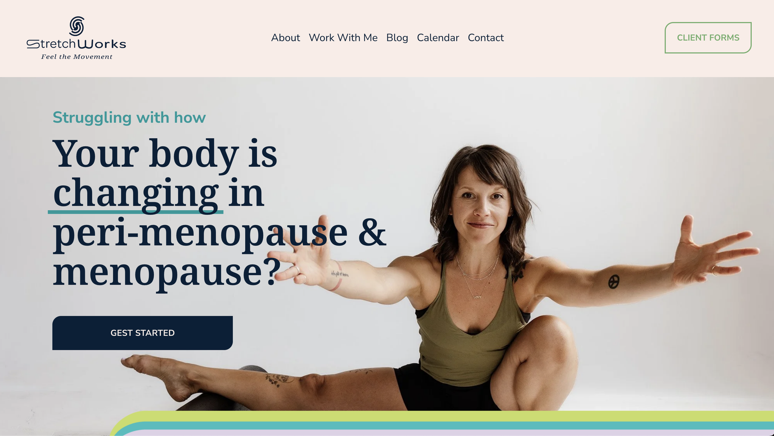
Bringing the Website to Life
When we moved into her Squarespace site, clarity was the goal:
Who she helps
How she helps them
Why it works
Lexy used my Website Copy Template and the Brand Summary we developed to draft her copy — pulling forward the tone, clarity, and confidence that had emerged during the branding process.
From there, I stepped in as copy editor, fine-tuning her words so everything felt approachable, clear, and aligned with her brand.
Her final website is not just “pretty” — it’s aligned, clear, and deeply true to who she is and how she works.
Having a full set of branded photos by Emma Pion-Berlin made the design process incredibly smooth. Her images brought so much personality and cohesion to the site — the perfect accent to the overall brand aesthetic.
Lexy’s Squarespace website now holds space for her growing YouTube library, her in-person training, her private sessions, and the expansions she’s dreaming into.
It’s a brand ready for its next chapter.
See the live website


The Final Feeling
The completed identity feels:
Vibrant — alive with movement
Calm + strong — grounded, steady, confident
Honest + real — no fluff, no fitness noise
Playfully sassy — just like Lexy’s personality and presence
StretchWorks now looks the way her clients already experience her:
encouraging, smart, empowering, and fully dedicated to helping women feel strong from the inside out.
And that, to me, is the heart of great branding — aligning the inner truth with the outer expression.
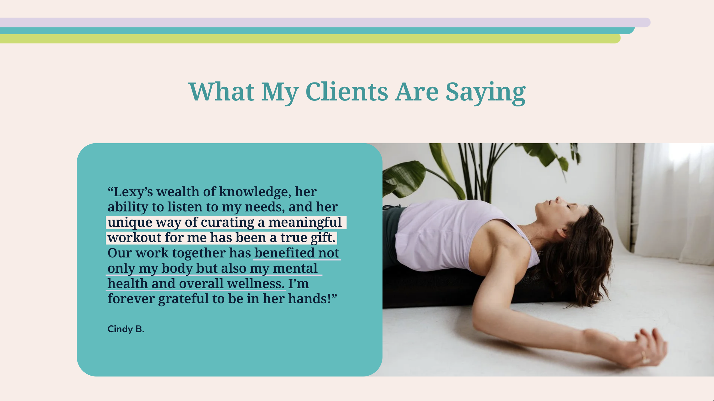
“Thank you so much for your work, Lexis. I’m inspired by the brand summary and so grateful for the opportunity to work with you. I think you’re quite talented and I value the work you’re doing with me SO MUCH!”
Ready for a brand that feels unmistakably you?
If you’re dreaming of a brand that reflects your brilliance with clarity, intention, + joy, I’d love to help.

Hiya! I’m Lexis, the author of this blog.
If you’re here to build a brand that feels beautiful, meaningful, and true to you, I’m so glad you found your way.
At Most Beautiful Design, I blend intuition, creativity + strategy to help purpose-driven entrepreneurs craft brands that truly reflect who they are.
When I’m not designing, you’ll find me watercoloring alongside my kids, wandering outside, or cozied up with a good book (creativity, business, or personal growth are always at the top of my list). And yes—color makes me ridiculously happy!
Curious about what lights me up and how I work?
Start here to get a feel for my vibe, or peek at my portfolio if you're dreaming up a brand or website that finally feels like you.