A Brand That Finally Felt Like Her: The Story Behind Playful Integration
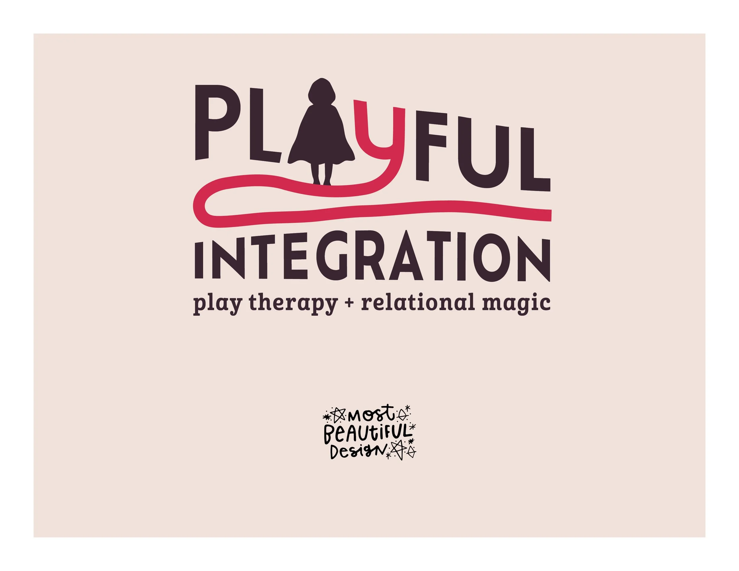
The Vibe + Vision
Client:Playful Integration
Industry: Play therapy + sand therapy (Portland, OR)
Project Scope: Brand strategy (Brand Clarity Key), logo design, visual identity, website design (Squarespace), and full website copywriting
Vibe Words: tender, playful, handmade, emotionally safe, mythic but grounded
Goal: A brand that let her own every quirky, specific thing about how she works — and still read as professional
Meet Heather
Heather Fairlee Denbrough is a Registered Play Therapist Supervisor in Portland, Oregon. She works with parents untangling patterns they inherited, and with neurodivergent teens and adults figuring out their own way of being in the world.
Her therapy room has a sand tray in it. It has toys, figures, objects — the whole language of play therapy, which is a real clinical modality and not a softer version of "real" therapy.
She's also neurodivergent herself, deeply drawn to myth and symbolism, and unapologetic about the fact that her work involves intuition and spiritual attunement alongside nervous system science.
That combination is the whole point of her practice. It was also the thing her brand kept flattening.
When Your Brand Says Something You Didn't Mean
Heather's existing logo leaned mystical — the kind of imagery that reads as tarot, astrology, fortune-telling.
She is spiritual. That part wasn't wrong.
But the imagery pointed at one narrow piece of her — and left out the rest. Play therapy. Sand therapy. Sixteen years in community care. None of that was visible.
And the secondary piece of her business — consultation and training for other therapists — needed to read as credible expertise, not vibes.
She didn't need to be less herself. She needed a brand that could hold all of her without accidentally mistranslating one part of it.
Branding for Play Therapists Starts With Clarity
Every project I take on begins with the Brand Clarity Key — before any design happens.
Heather filled out her questionnaire in a single day. (Nobody does that.)
What came back was rich, layered, and full of language nobody could have invented for her:
relational magic
the patterns you carry didn't start with you
choose what to carry forward
a tender space to explore what shaped you
She also kept circling one image without quite naming why: Little Red Riding Hood.
Not the fairy tale. The archetype underneath it — a girl walking into the woods, cloaked, curious, going toward something rather than away.
That's the work. Someone entering their own inner landscape with a little protection around them and someone walking alongside.
That was the key. Once we had it, everything else had somewhere to go.
Translating Feeling Into Form
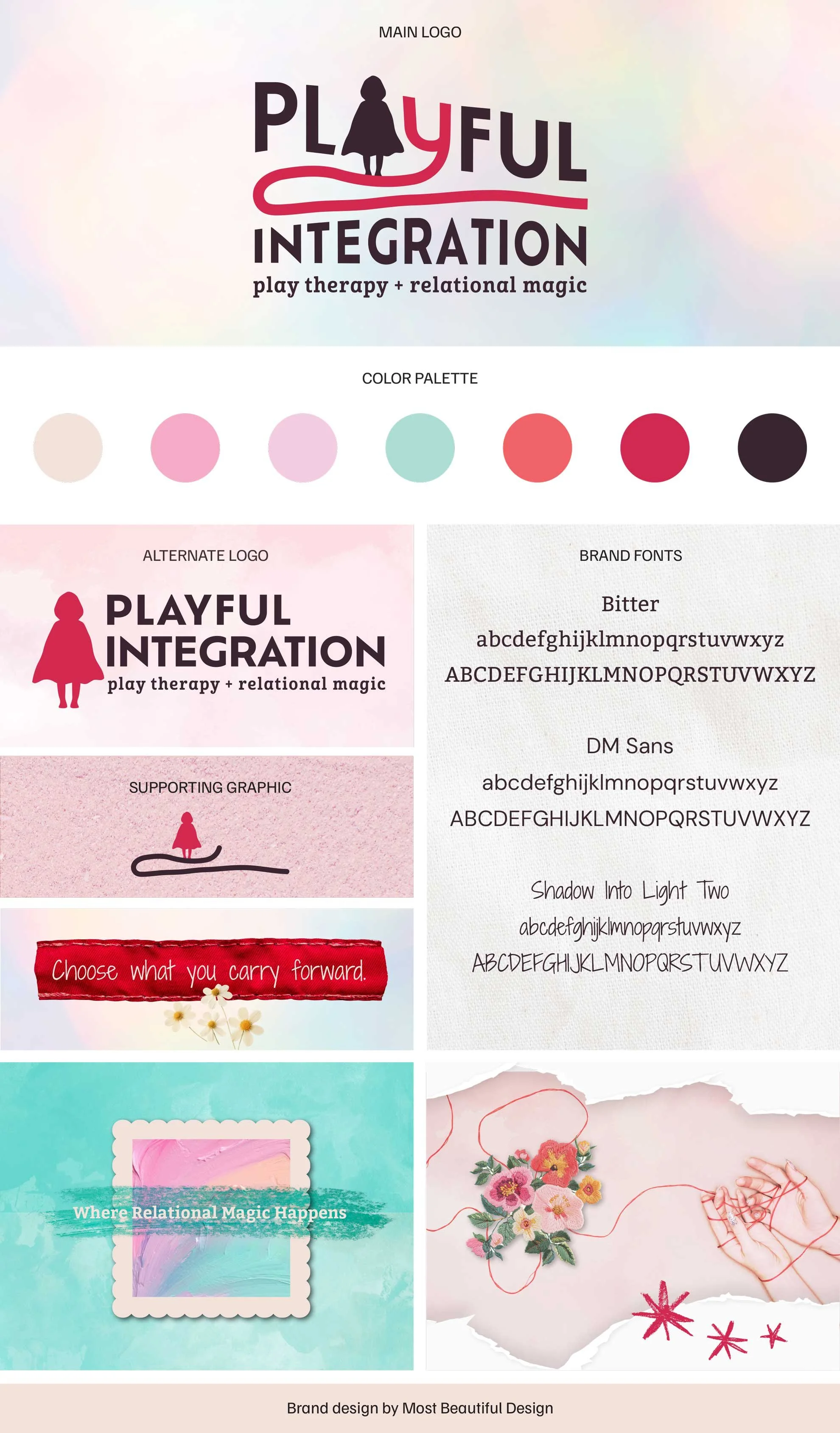
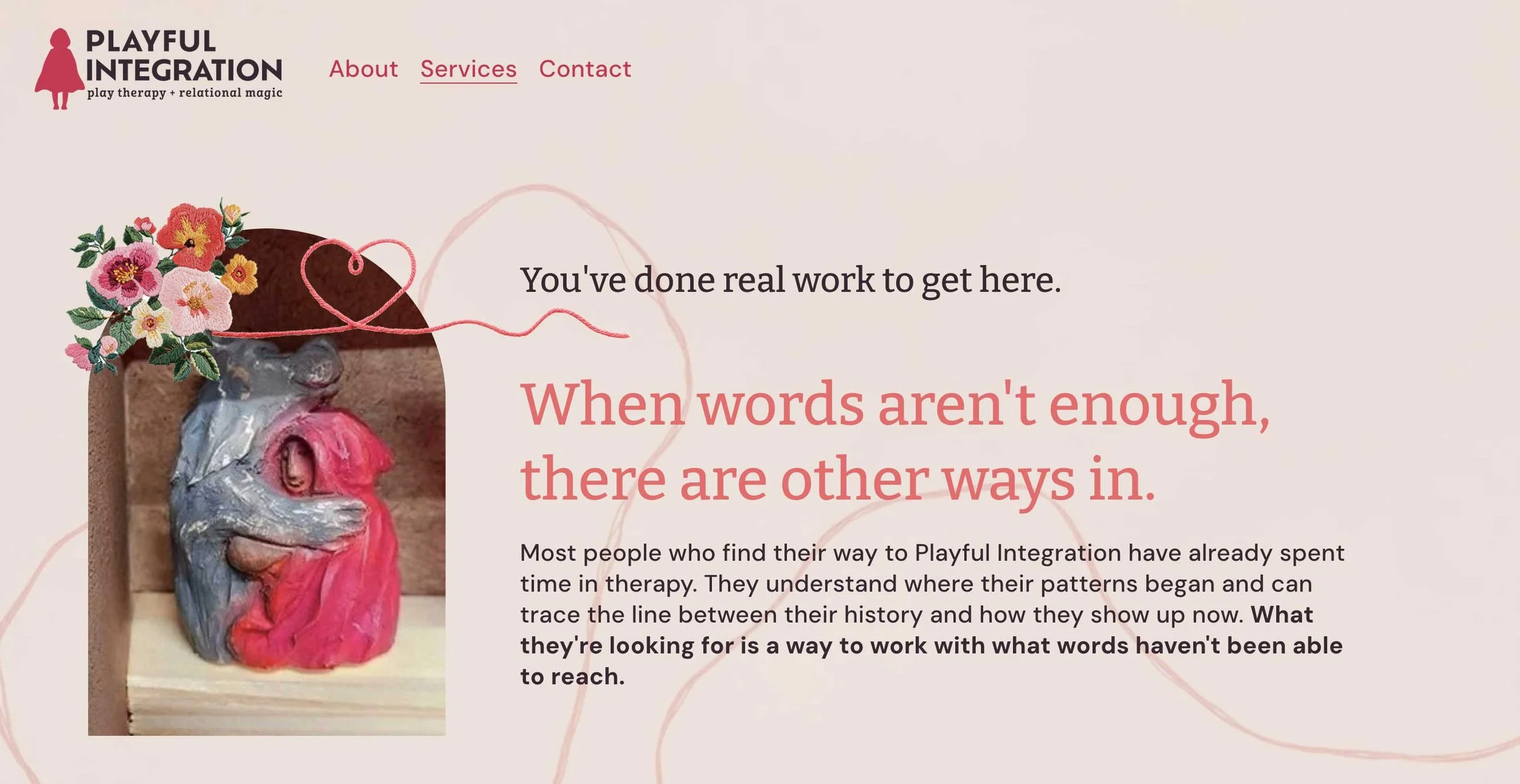
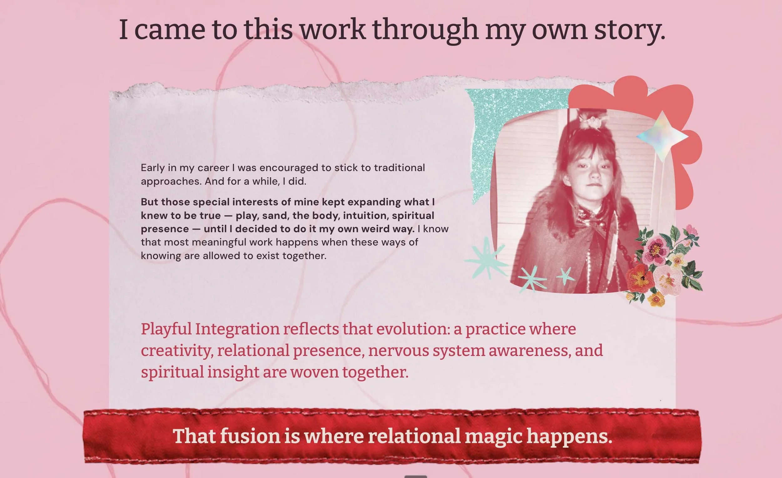
Heather's moodboard was full of texture — torn paper, embroidery, stitched thread, painterly color, collage edges. Handmade things. Nothing slick.
The design challenge was real, though: how do you make something that feels handmade and mythic without tipping into cartoon fairy tale or fortune teller?
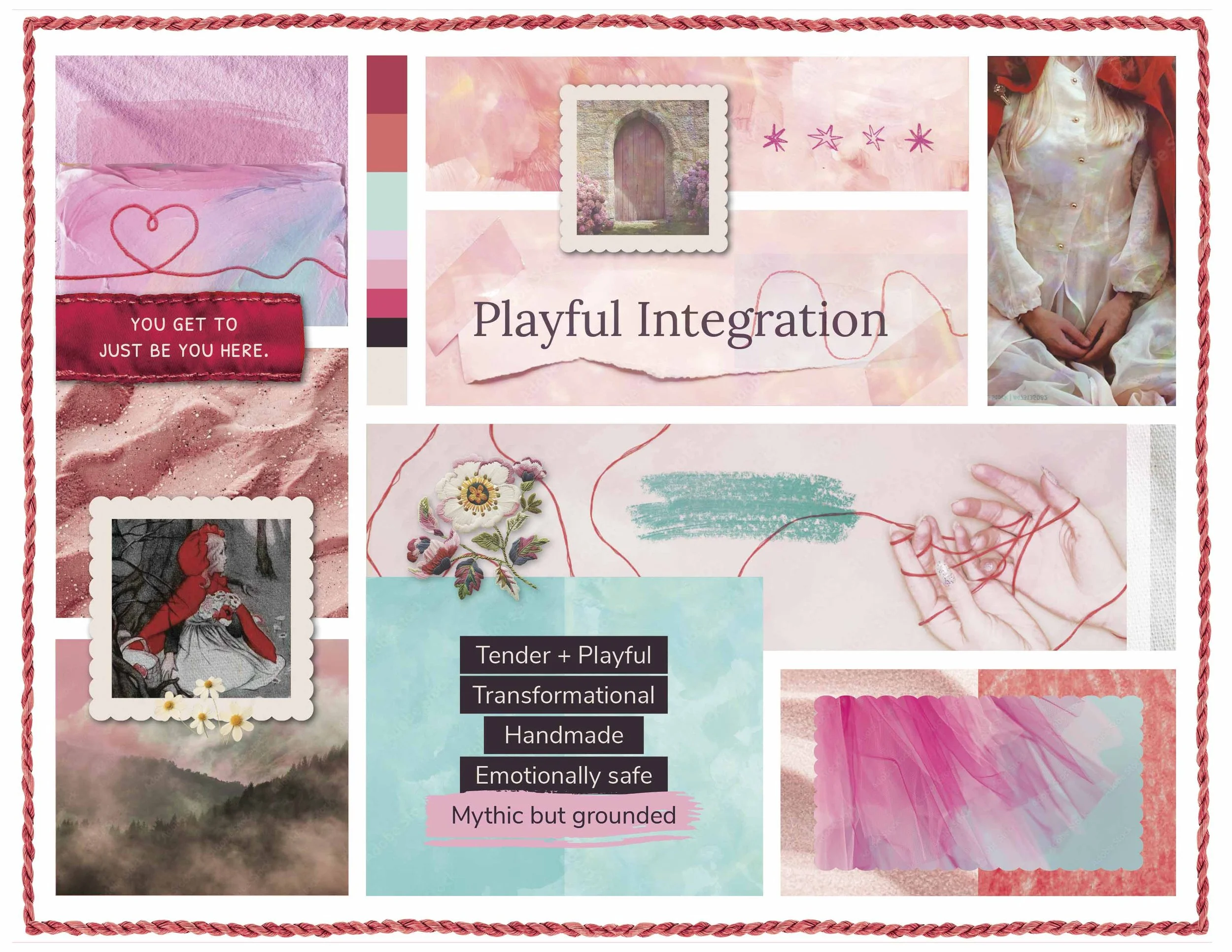
The answer was restraint.
We built the identity around three motifs, used sparingly:
The red thread — memory, lineage, the story you follow back. It appears as a guiding line, not decoration.
The threshold — arches, doorways, framed openings. Entering the inner world.
The cloak — carried in as red accents rather than illustrated.
No literal wolves. No fairy tale illustration. Symbolic atmosphere instead of storybook picture.
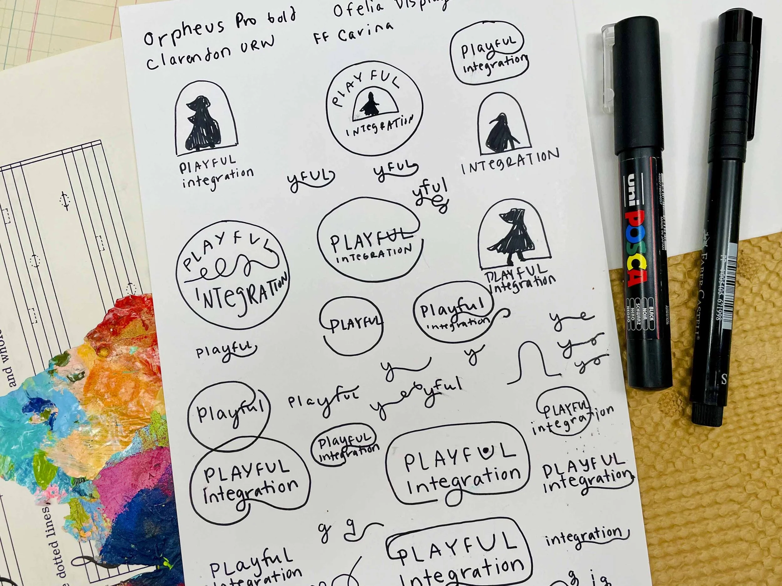
For the mark itself, I hand-drew the organic elements and traced them rather than constructing them digitally. That's what gives the identity its slight irregularity — the line isn't perfect, and it isn't supposed to be.
The palette came directly from what Heather is drawn to. She loves color — coral especially, and pastels, the whole soft expressive range.
We built the palette from that rather than toning it down: coral flame, rose glow, wild strawberry, lilac mist, glasswater.
Pastels read as childlike on their own.
Pastels with a grounding dark read as tender and serious at the same time — which is exactly the register her work lives in.
Typography paired a warm serif with a clean sans and one hand-lettered accent, used only where it earned its place.
Roughly 70% painterly mythic atmosphere, 30% tactile handmade collage.
That ratio kept it artful without becoming cluttered.
Modern folk tale, made by hand. Adult. Psychologically serious. Still full of play.
The Moment It Landed
When Heather saw the identity, she wrote back:
“I AM LITERALLY CRYING. This is SO BEAUTIFUL, it’s SO GOOD, it’s SO ME, it’s so what I wanted!!”
She's a Writer. She Still Couldn't Write Her Own Copy.
Heather likes to write. She's good at it. So when we started, website copy stayed on her plate.
Then the project stalled — for months. This was the longest hold in the whole timeline, and it wasn't a design problem or a decision problem. It was a blank document.
In her words:
“I doodled around with the copy for the longest time, because I was like, Heather, just do this. You know you can do this. And I could — but it just was so much easier to be like, can you just take what I’ve already said and turn it into that?
I can get all the creative-y whatever out, and then condensing it, my mind was just like — it cannot possibly be condensed.”
"I doodled around with the copy for the longest time, because I was like, Heather, just do this. You know you can do this. And I could — but it just was so much easier to be like, can you just take what I've already said and turn it into that?"
"I can get all the creative-y whatever out, and then condensing it, my mind was just like — it cannot possibly be condensed."
When I finally offered to write it, she said thank God out loud.
Liking to write is not the same as being able to write your own marketing copy. Those are two different skills.
The first is expression. The second is compression — taking everything true about your work and cutting it down to the few sentences a stranger will actually read.
You can be genuinely gifted at the first and completely stuck on the second. Especially when the subject is you.
So I stopped waiting for clients to ask. Copywriting is now something I offer directly, early, before the document has a chance to sit there open and blinking for two months.
Everything on Heather's site came from her own words — her questionnaire, her Brand Clarity Key, the phrases she'd already said out loud. I didn't invent her voice. I condensed it.
Play Therapy Website Design That Feels Like the Work Itself
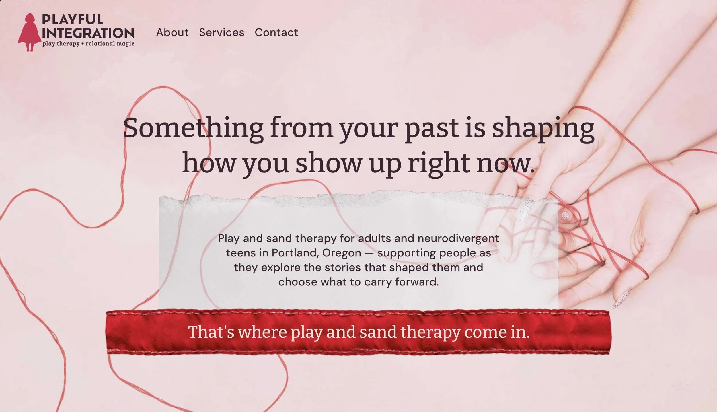
With the brand and copy clear, we built the full site in Squarespace.
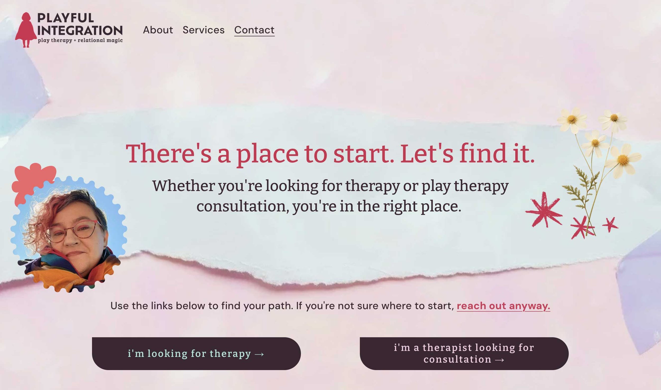
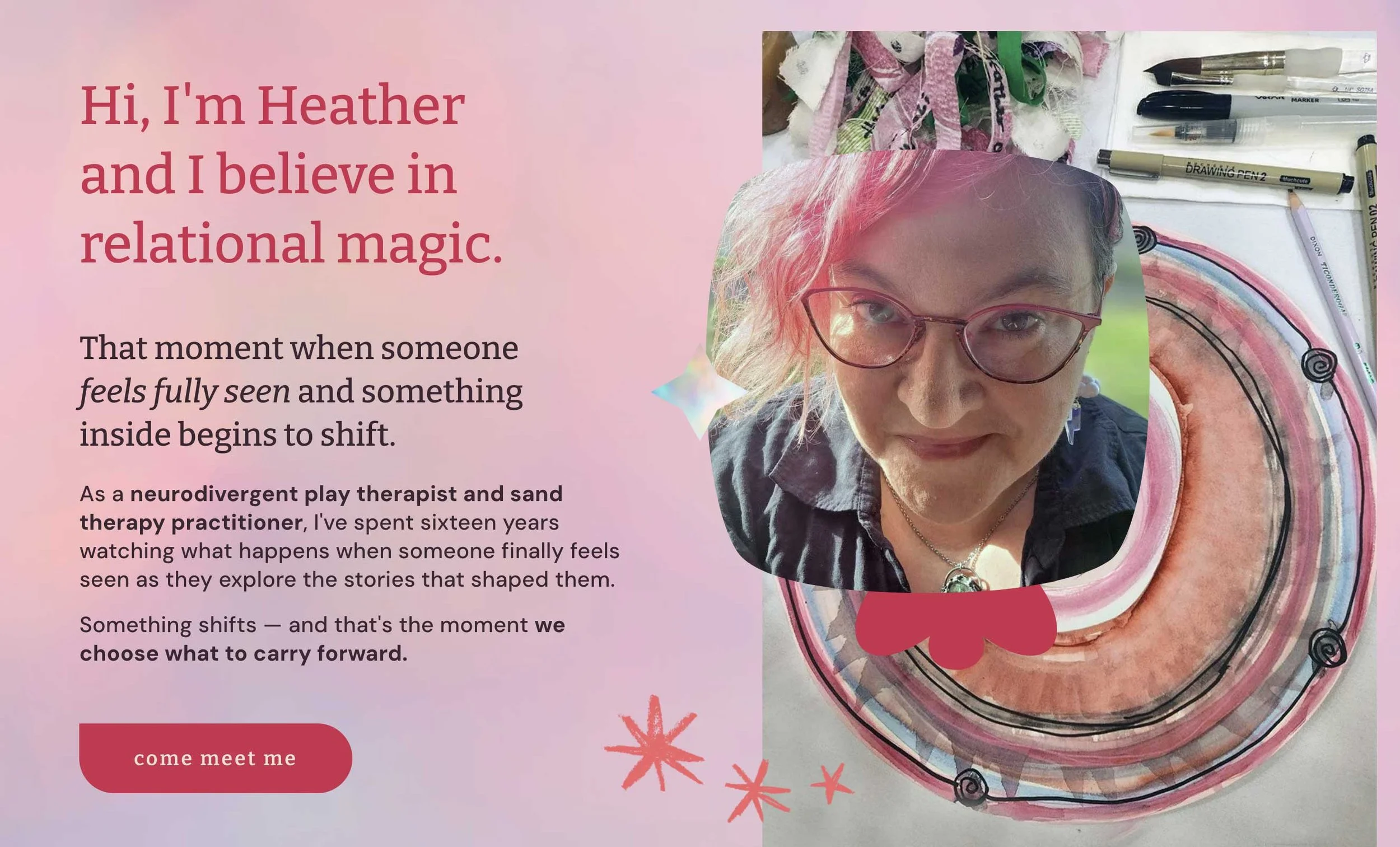
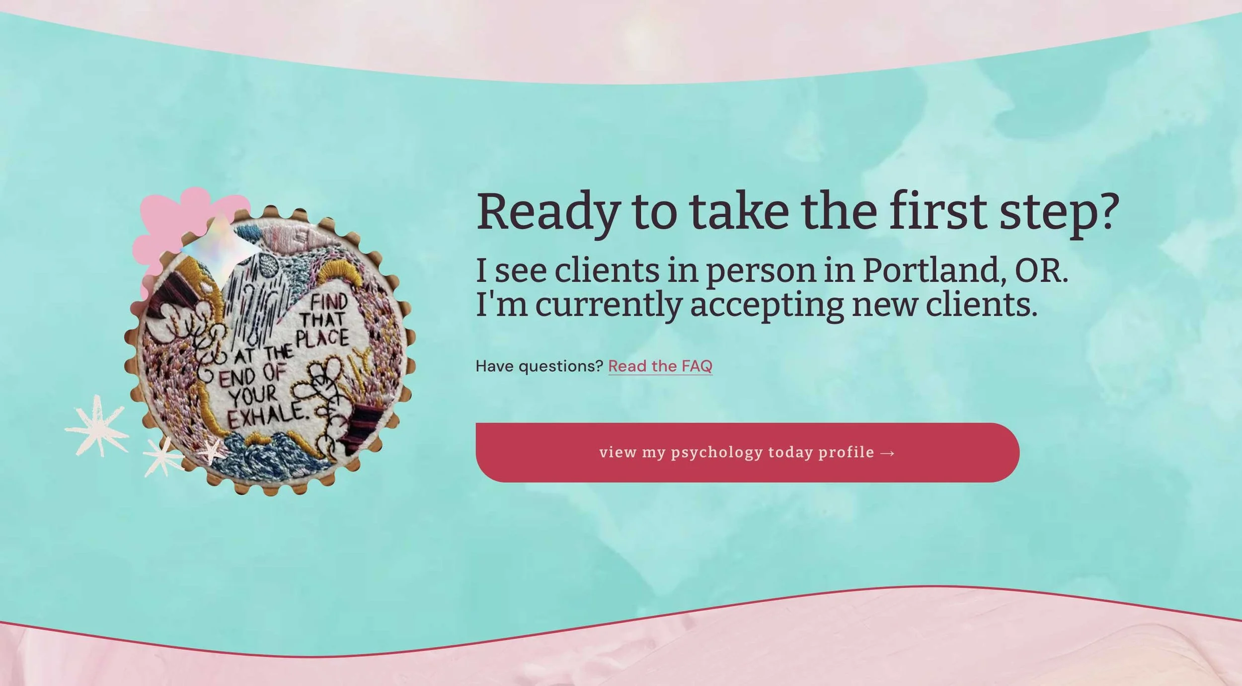
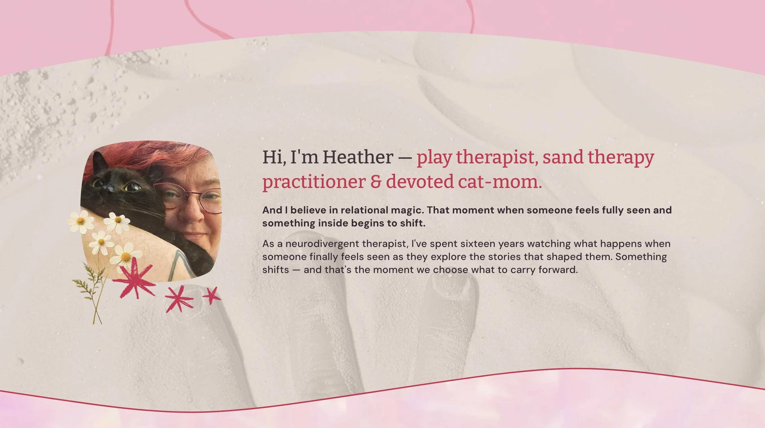
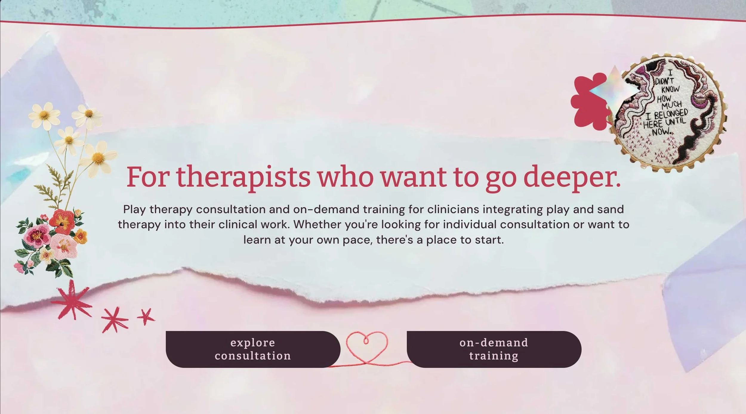
The site moves like chapters of a story — each page a threshold into the next. Handmade elements appear once per section rather than everywhere at once. The red thread guides the eye without shouting.
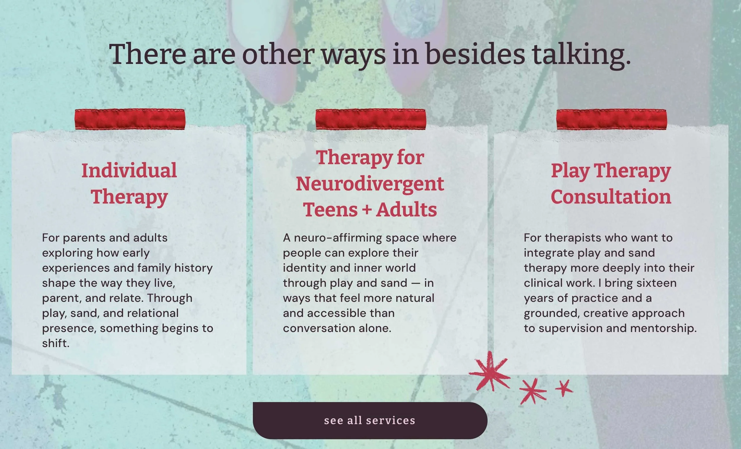
Play and sand therapy stay explicitly named. Not abstracted into "creative approaches." Parents searching for a play therapist need to find one.
Neurodivergent-affirming language is stated plainly, not implied. The people looking for it are looking for those exact words.
The consultation offering for other therapists got its own real estate, supported by testimonials from clinicians who've trained with her — which is the appropriate form of social proof when you're a therapist and can't ethically use client testimonials.
Every button on the site is lowercase. Small thing. Sets the entire tone.
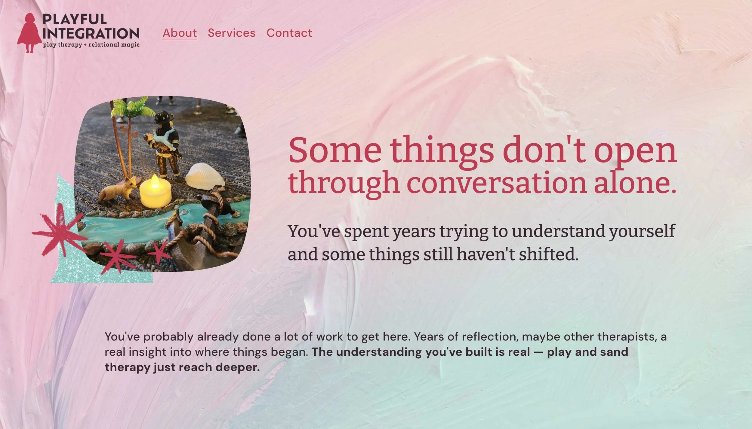
Imagery is where a lot of therapist websites lose the thread. Not because the photos are bad — they're just interchangeable. The same soft-focus hands, the same calm window light, showing up on a hundred different practices.
Heather is an artist — she paints and embroiders, and she had photographs she'd taken herself of her art, so we started there. She need professional photos to make the aesthetic work. The embroidery continued the thread theme.
When I saw her embroidery with the words “The red cave alone,” I knew exactly where it went the moment I saw it.
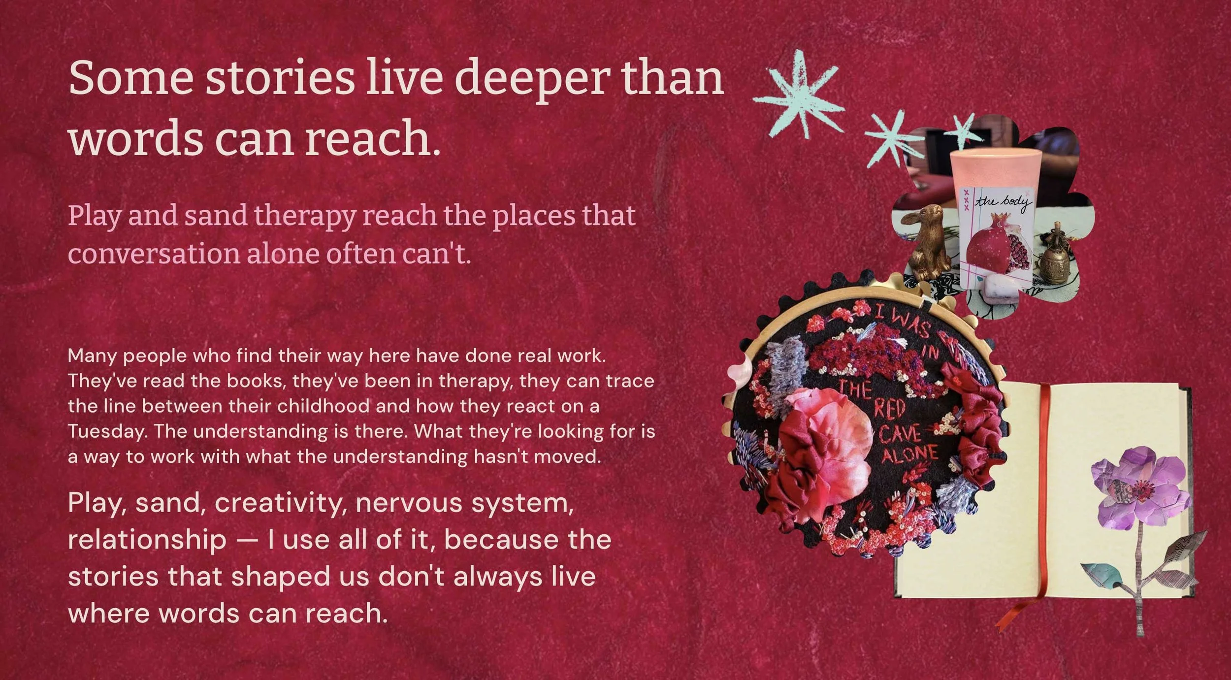
Where we needed stock, I chose it to sit beside her artwork rather than compete with it: texture, color field, and atmosphere instead of people. Nothing that would announce itself as stock next to something she made by hand.
My job was mostly editorial: telling her which pieces were strongest — the ones that held up alone, without explanation. That turned out to be the useful part.
“What really helped me was when you said, these were the strongest images. It gave me language for what I was looking for. Then I could go back through my stuff and look for more that just stood by themselves.”
“I LOVE everything about the website - every time I go to post it or send it to someone I feel so satisfied and happy with it! Thank you for everything!!”
What She Has Now
Playful Integration has a brand and a website that don't require her to translate herself before she shows up.
A practice that:
lets the right person recognize her — and reads as clinically credible while it does
reads as expert to a therapist seeking consultation
and still looks like it was made by hand, by a person who thinks in myth and works with sand
Nothing was smoothed out. It just got clearer.
✨ See the full website here
This site launched in June 2026.
“This was just such a delightful experience. When I look at it, I’m like — oh, this is exactly what I’m doing.”
That is the sentence I'm always listening for.
Not "this looks good." This is what I actually do.
Thinking About Your Own Brand?
If you're doing work you're proud of but your brand keeps saying something slightly off — that gap is the whole reason I do this.
You can't design your way to clarity. You have to find it first.
Hiya! I’m Lexis, the author of this blog.
I help women whose work has evolved past their branding — the gap between who you've become and how you're showing up is the whole thing I'm here for.
At Most Beautiful Design, every project starts with the Brand Clarity Key: my process for finding what's already true about your work before we design anything. Then I build the brand and website around it.
When I'm not designing, you'll find me watercoloring alongside my kids, wandering outside, or cozied up with a good book. And yes — color makes me ridiculously happy.
Curious how I work?
Start here to get a feel for my vibe, or peek at my portfolio if you're dreaming up a brand or website that finally feels like you.